Visual Storytelling

zayt magazine mockup 1

Zayt Magazine

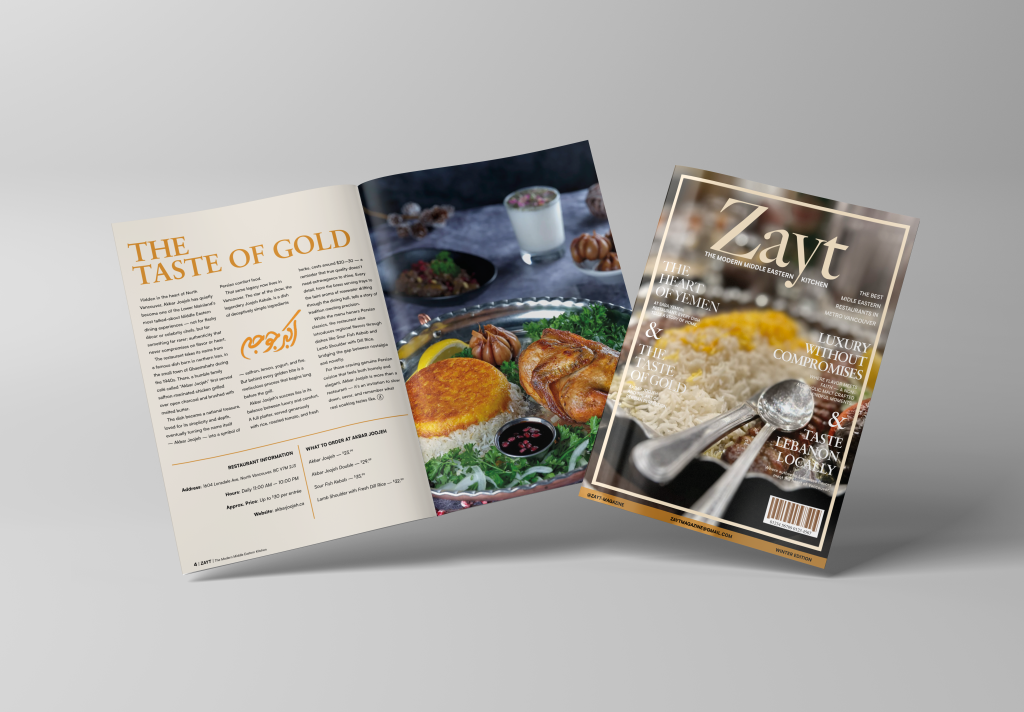
Project Overview ZAYT is a food and culture magazine focused on Middle Eastern restaurants in Metro Vancouver. The project was designed as a full editorial publication, bringing together restaurant features, food photography, cultural storytelling, advertisements, infographics, and magazine-style layouts. The goal was to create something that felt warm, elegant, and food-focused while still being modern enough for a local Vancouver audience. I wanted the magazine to feel less like a simple restaurant guide and more like a curated dining experience, where every spread introduces a place, a dish, or a story with its own mood. Editorial Concept The concept behind ZAYT was to celebrate Middle Eastern food through both design and storytelling. Each restaurant feature was written and designed to highlight more than just the menu. I wanted to show the atmosphere, culture, comfort, and memory behind the food. The magazine includes features on restaurants such as Akbar Joojeh, Saba Yemeni Restaurant, Yasmina, Cazba Persian Grill, Sahel Market & Restaurant, Damaskino Shawarma, and others. Each spread uses a different layout approach while still staying connected through the same overall editorial identity. Design direction The visual direction was built around warmth, elegance, and cultural detail. I used cream backgrounds, gold and brown tones, serif typography, decorative borders, and Middle Eastern-inspired patterns to give the magazine a refined but inviting feeling. The design needed to feel premium, but not cold or overly formal. Food photography played a major role in shaping the layouts. Some spreads use large full-page images to create impact, while others use smaller photo blocks, menus, pull quotes, and restaurant information boxes to guide the reader. The challenge was balancing strong visuals with readable editorial content. Visual system The magazine uses a consistent visual system across the full publication, but each section has its own personality. Restaurant features use large titles, structured text columns, food imagery, and information boxes for address, hours, pricing, and menu recommendations. The typography combines elegant serif headlines with clean body text, helping the magazine feel both cultural and readable. Decorative details, borders, subtle patterns, and warm colour accents help connect the pages without making every spread look the same. Feature spreads Each restaurant spread was designed to tell a small story. Some pages focus on atmosphere and restaurant identity, while others highlight a signature dish or cultural detail. The Akbar Joojeh spread became the main infographic piece, using an anatomy-style layout to break down the plate, ingredients, origin, and food traditions in a more visual way. Other spreads use a more editorial structure, combining photography, text columns, restaurant details, and menu recommendations to create a complete reading experience. This helped the magazine feel varied while still staying connected through the same tone, typography, and visual language. I also created supporting pages and advertisements, including an Uber Eats ad, a BC Halal Food Festival spread, and a halal non-alcoholic beverage ad. These pieces helped the magazine feel more complete and realistic, like a publication that could actually exist with editorial content and sponsored sections. Final Reflection This project helped me understand how much planning goes into a full magazine design. It was not only about making individual pages look good; the whole publication had to feel connected from cover to final spread. I had to think about pacing, image placement, typography, margins, spacing, and how each page would feel as part of a larger reading experience. Working on ZAYT also pushed me to think more carefully about cultural tone. Since the magazine focused on Middle Eastern food and restaurants, the design needed to feel respectful, warm, and authentic without becoming too decorative or cliché. The challenge was finding a balance between elegance, readability, and cultural atmosphere. Overall, ZAYT became one of my strongest editorial projects because it brought together writing, layout, food photography, branding-style details, infographic design, and publication design. It taught me how to build a visual rhythm across many pages while still giving each story its own identity.

Zayt Magazine Read More »

screenshot 2026 06 01 015427

When The Petals Fall

project OVERVIEW When the Petals Fall was my second completed novel, but the first one I printed, sold, and published on Amazon. The project began with a self-written story and grew into a full visual communication system, including the book cover, promotional poster, bookmarks, Instagram carousel, social media grid, and web banner. The project was built around quiet emotion and visual softness. Instead of using loud or dramatic visuals, I wanted the design to feel warm, simple, and personal — almost like a memory. Every piece was created to support the tone of the story and make the book feel complete beyond just the manuscript. Story concept At its heart, When the Petals Fall is a story about love, memory, and the small moments that stay with us. Kei and Reina’s connection does not grow through big dramatic scenes, but through quiet comfort, everyday routines, and the slow trust that forms between two people. The title reflects the emotional tone of the story. Like petals falling from a flower, some moments are temporary, but they still leave something behind. I wanted the visual system to carry that same feeling — soft, delicate, slightly bittersweet, and grounded in human connection. Design Direction The cover uses a warm illustrated style to reflect the emotional softness of the story. Kei and Reina are shown in a peaceful spring setting, surrounded by blossoms, calm skies, and gentle light. I wanted the design to feel romantic without being too dramatic, and nostalgic without feeling old-fashioned. The colour palette uses soft pastels and natural tones to create a calm, intimate atmosphere. Floral details, hand-painted textures, and open space help the design feel delicate and personal. The back cover extends the same mood with a blooming orchard and pastel sky, making the full book design feel connected from front to back. promotional system After finishing the book design, I expanded the project into promotional materials for both print and digital use. This included a poster, bookmarks, a web banner, and a structured social media grid. Each piece followed the same visual direction so the campaign felt consistent across different formats. The goal was to make the book recognizable wherever it appeared. The poster introduced the emotional tone of the story, the bookmarks gave the project a physical promotional piece, and the web banner adapted the identity for online use. Together, these pieces helped turn the book into a fuller visual campaign instead of just a standalone cover. Digital extension The digital side of the project included a personality-test style Instagram carousel that extended the book’s soft, introspective tone. The carousel asked gentle questions about memory, peace, and emotion, guiding viewers through a small interactive experience connected to the themes of the novel. The result options, such as “A Brushstroke of Silence” and “The Colour of Us”, were designed to feel poetic and personal. Each frame used muted colours, delicate imagery, and simple layouts so the experience stayed calm, readable, and emotionally connected to the book. Final Reflection This project was special to me because it brought writing and design together in a very personal way. When the Petals Fall started as a story, but through the cover, layout, poster, bookmarks, carousel, and web banner, it became a complete creative project with its own visual identity. Working on it taught me how important tone is when designing around a narrative. The story was quiet and emotional, so the visuals had to support that feeling without overpowering it. I had to think about colour, illustration, spacing, typography, and campaign pieces as parts of the same world. Overall, this project helped me understand how a book can live beyond its pages. It showed me how design can support storytelling, create atmosphere, and make a written piece feel more complete, memorable, and personal.

When The Petals Fall Read More »

fast fashion mockup 2

Fast Fashion Must Die

project overview Fast Fashion Must Die is an awareness poster created around the waste and overconsumption caused by the fast fashion industry. The project focuses on how clothing is often treated as disposable, even though textile waste has a real impact on local communities and the environment. Instead of making the poster feel soft or overly clean, I wanted it to feel loud and uncomfortable. The title is direct on purpose. It is meant to stop the viewer for a second and make the issue feel urgent, not distant. Design Approach For the visual direction, I moved away from the usual natural, minimal look often used in sustainability design. I wanted the poster to feel more punk, rough, and rebellious because the message itself is frustrated. The distressed typography, dark texture, electric blue, and toxic green all work together to create a feeling of pollution, urgency, and resistance. The layout is information-heavy, but I still wanted it to feel energetic. The poster includes statistics, local context, possible solutions, and a QR code, so it works both as a visual statement and as a practical awareness piece. message & purpose The goal of this project was not just to tell people that fast fashion is harmful, but to give the message more attitude and action. I wanted the poster to speak to a younger audience in a way that felt bold, direct, and harder to ignore. The solutions on the poster keep the campaign grounded. Instead of only showing the problem, it points toward small local actions like clothing recycling drop-offs, supporting sustainable brands, and working with thrift shops. That helped the poster feel less like a warning and more like a call to do something. Key visual elements The distressed gothic lettering was chosen to make the poster feel more aggressive and anti-establishment, almost like a protest flyer. The electric blue and green colour palette creates a toxic, high-energy look that connects to pollution, waste, and urgency. The torn textures and block-based text sections help the poster feel raw while still keeping the information readable. The QR code adds a functional element, turning the design from only a visual statement into something viewers can actually interact with. Final Reflection This project was a good challenge because it pushed me to design an awareness poster that did not feel too safe or predictable. Sustainability design is often calm, clean, and nature-focused, but I wanted this poster to feel more angry and urgent because the issue itself is not gentle. Working on Fast Fashion Must Die helped me think about how tone changes the way people receive information. The poster had to include facts and solutions, but it also needed enough visual energy to make someone stop and actually look at it. Balancing those two things was the main challenge. Overall, this project taught me that awareness design can still have personality. It can be informative without being boring, and it can be loud without losing its message. For me, the poster became a way to turn frustration into something visual, direct, and useful.

Fast Fashion Must Die Read More »

blind justice vinyl 2

Blind justice

project overview Blind Justice is a fictional vinyl cover I created around the idea of justice feeling messy instead of clean. I wanted it to look like something intense had just happened, but without explaining the full story. The cover has this heavy, gritty mood — like a crime scene, a fight, or a moment from a city that never really feels safe. For me, the project was less about making a normal album cover and more about creating a feeling. The figure, shadows, red-orange colour, and rough texture all work together to make the design feel loud, tense, and a little uncomfortable. I wanted people to look at it and wonder what kind of music would live inside that world. concept spark The idea came from a fight scene in Daredevil: Born Again that stuck with me. It was quick, rough, and tense, and I loved the shot of Matt jumping in to break the guy’s knees. That frozen moment had so much force in it that I knew I wanted to turn that kind of energy into a vinyl cover. I wanted the design to feel like the music belonged to a story about conflict, pressure, and justice that doesn’t have a simple answer. Instead of making justice look calm or balanced, I wanted the design to feel messy and uncertain. The kind of justice that comes from anger, instinct, and survival, where you’re not fully sure who is right or wrong. Visual Direction The visual direction leans heavily into contrast: light against shadow, movement against stillness, law against chaos. The orange-red colour palette creates heat and urgency, while the dark shadows make the scene feel dangerous and unresolved. Texture was an important part of the design. The grain, rough edges, and distressed treatment give the cover a raw physical quality, almost like a protest poster or old crime print. The typography is bold and direct, stamped into the composition like evidence from a case file. Key visual elements The silhouetted figure creates the main sense of action and impact, while the vertical bars suggest restriction, punishment, and the justice system itself. The composition uses those barriers both as design structure and as metaphor. The parental advisory label adds another layer of realism, helping the fictional album feel like a real music release. It also supports the aggressive tone of the project, making the cover feel more believable as a loud, intense, and emotionally heavy record. Final Reflection This was a fun little project that I really enjoyed working on because it gave me space to create something bold, moody, and cinematic without overthinking it too much. Blind Justice started from one strong visual idea, but it slowly became more about building a whole feeling around that moment. The project helped me see how much story can fit into a single cover design. The figure, bars, colour, texture, and typography all had to suggest a bigger world without explaining everything directly. I wanted the cover to feel intense and a little uncomfortable, like the viewer was catching one frame from a larger story. Working on this also reminded me that not every project needs to be huge to be meaningful. Sometimes a smaller piece can still teach you a lot about atmosphere, symbolism, and visual tension. For me, Blind Justice became a simple but strong experiment in making packaging feel narrative instead of just decorative.

Blind justice Read More »

artboard 3

Lies In The Stars

project overview Lies in the Stars is a conceptual movie poster created from a college brief that asked us to combine a classic Disney story with a completely different genre. My concept was Pinocchio meets sci-fi, but instead of making it playful or fantasy-like, I pushed the story into a darker psychological world. The poster reimagines Pinocchio as a synthetic being trapped in a future controlled by programming, surveillance, and manipulation. The original idea of wanting to become “real” becomes less about becoming human and more about wanting freedom in a system that refuses to let him choose. concept origin The original story of Pinocchio is about identity, morality, and the desire to become real. I wanted to keep those themes, but translate them into a world shaped by technology and control. Instead of strings made from wood and thread, the puppet is controlled by invisible systems, data, and a larger force watching from above. That question became the base of the design: what if the puppet was not only a character, but a metaphor for someone trapped inside a programmed world? Visual Direction The visual direction combines sci-fi atmosphere with horror-inspired tension. I used a dark colour palette, red lighting, cosmic textures, and a large wireframe hand to create a feeling of control and unease. The poster is not meant to explain everything directly. It uses mood, symbolism, and negative space to let the viewer feel the story before fully understanding it. The typography was designed to feel cinematic and slightly unsettling, connecting the poster to old sci-fi and horror film language while still feeling modern. Key visual elements The main wireframe hand represents control. It reaches down from above like a programmer, creator, or manipulative force, pulling the puppet through invisible strings. The puppet figure is cold and synthetic, showing innocence turned into something artificial and controlled. The space setting adds another layer to the concept. It makes the story feel distant, lonely, and larger than one character. The red tones suggest danger, fear, and emotional isolation, while the darker background helps the poster feel quiet and tense. Small details like binary code and constellation-like patterns hint at hidden systems behind the story. Final Reflection This project helped me understand how a familiar story can be completely transformed through genre, tone, and visual symbolism. Instead of simply placing Pinocchio into a sci-fi setting, I wanted the design to reinterpret the meaning of the story. The puppet became a symbol of control, lost autonomy, and the fear of being shaped by a system you cannot escape. Working on Lies in the Stars pushed me to think more conceptually. Every visual choice had to support the darker version of the story, from the red colour palette and cosmic setting to the wireframe hand and cinematic typography. It taught me that a poster does not need to explain everything clearly to be effective. Sometimes the strongest design leaves space for the viewer to connect the meaning themselves.

Lies In The Stars Read More »

farisfaris bubblium brand asset mockup 4 nov24

Bubblium

concept overview Bubblium is a fictional sparkling water brand created for Gen Z and Millennials. Instead of following the clean, quiet style often seen in beverage branding, this project leans into personality, humour, colour, and unexpected flavour combinations. The goal was to make the brand feel less like a basic drink and more like a playful experience people would want to notice, try, and share. The concept was built around the idea of “zany refreshment.” Every part of the brand, from the name to the packaging and campaign pieces, was designed to feel energetic and a little unusual while still staying clear and recognizable. Bubblium became a full brand world, not just a logo or can design. Brand world The brand personality is playful, curious, adventurous, and social. Bubblium is meant to feel bold and unexpected, but still approachable enough for everyday use. It uses unusual flavour ideas, bright gradients, bubbly graphic patterns, and a cheerful tone of voice to create a brand that feels lively from every angle. A big part of the project was making sure the chaos stayed controlled. The visuals needed to feel fun, but not random. The flavour names, colour palettes, typography, labels, and digital pieces all had to feel connected, so the brand could be expressive without losing consistency. Visual identiy The visual identity was designed to feel bubbly, colourful, and slightly strange in a fun way. The logo uses soft rounded forms and gradient colours to reflect movement, flavour, and carbonation. The supporting graphics use bubbles, fruit-inspired patterns, and flowing wave shapes to create a sense of energy across the brand. Typography also played an important role in giving Bubblium its personality. The type needed to feel playful enough for the brand voice, but still readable across packaging, posters, social media, and digital applications. The result is a system that feels light, expressive, and flexible across different formats. Packaging became one of the strongest parts of the project. Each flavour was given its own colour direction, gradient mood, and label treatment while still following the same brand structure. This helped each can feel collectible and different, while still belonging to the same Bubblium family. Digital and print applications After building the core identity and packaging, I expanded the brand into digital and print applications. This included social media pieces, billboard-style mockups, branded merchandise, posters, stickers, badges, and other promotional items. The purpose was to show how Bubblium could live beyond the can and become a fuller brand experience. Each application was designed to feel connected but not repetitive. Some pieces focused more on the product, while others pushed the playful brand voice through bold type, bright colour, and strange flavour-driven messaging. This helped the brand feel flexible across different platforms while still keeping the same energetic personality. Motion & campaign The motion and campaign pieces were created to give Bubblium a stronger sense of rhythm and movement. I designed short digital ads that could work for platforms like TikTok and Instagram, using animated typography, flavour splash transitions, product flashes, and quick brand moments. This part of the project helped the brand feel more alive. Since Bubblium is built around energy, fizz, and personality, motion gave the identity another layer. The campaign pieces show how the brand could catch attention quickly while still keeping the same playful visual language. Label & packaging system The label system was created to make each flavour feel like its own small world. The dual-gradient backgrounds represent the mood of each flavour, while illustrated fruit patterns and wave textures add movement and texture. The centred logo keeps the brand recognizable, and the flavour names stay bold enough to stand out on a shelf. I also added real-world packaging details like nutrition panels, ingredient lists, barcodes, and bilingual information to make the fictional brand feel more believable. These small details helped the project move beyond decoration and feel closer to a complete product system. https://ffaris.vccdigitalmedia.ca/Digiversely/wp-content/uploads/2026/06/Bubblium-Dynamic-Express-AD.mp4https://ffaris.vccdigitalmedia.ca/Digiversely/wp-content/uploads/2026/06/Bubblium-Ad.mp4 Final Reflection Bubblium challenged me to think about branding as a full world instead of a single visual style. It was not enough to make the logo or labels look colourful; the whole brand had to feel consistent across packaging, social media, print, merchandise, and motion. Every piece needed to feel like it came from the same personality, even when the designs were loud, playful, and intentionally unusual. This project also taught me how to balance creativity with structure. Because the brand is based on weird flavours, humour, and visual energy, it could easily become messy. I had to create enough rules through typography, colour, layout, and recurring graphic elements so the brand could stay recognizable while still feeling fun. Overall, Bubblium became one of my strongest examples of building a complete brand system. It helped me understand how visual identity can create a mood, how packaging can carry personality, and how a fictional product can feel believable when every detail supports the same idea.

Bubblium Read More »

poster 1 mockup 1

BreakTheBind

campaign overview Break the Bind is a men’s mental health awareness campaign built around the pressure many men feel to stay silent, composed, or “strong” even when they are struggling. The project uses posters, digital ads, and social media storytelling to challenge those expectations and create a message that feels direct, emotional, and easy to connect with. Rather than treating awareness as a one-time message, the campaign focuses on long-term emotional openness. It encourages men to speak honestly, ask for support, and understand that vulnerability is not a weakness. The visual direction was designed to feel bold and human, using strong contrast, expressive imagery, and short messages that can hold attention quickly. The Core message The main concept behind the campaign is the idea of breaking away from emotional silence. The “bind” represents the invisible pressure created by phrases like “man up,” “don’t cry,” or “deal with it.” These expectations can make it harder for men to talk about fear, sadness, anxiety, or loneliness. The campaign’s goal was to turn that hidden struggle into something visible. Each design piece explores a different part of that emotional experience, from masking pain in public to feeling alone privately. The work was created to feel supportive without becoming soft or overly polished — serious, but still approachable. Visual Direction The visual style was built to feel intense but controlled. I used bold colours, strong contrast, layered typography, and emotional image treatment to reflect the tension between what someone shows on the outside and what they may be feeling inside. The designs needed to be eye-catching, but they also had to carry the seriousness of the topic. A lot of the campaign depends on emotional balance. If the visuals were too clean, the message could feel distant. If they were too chaotic, the message could become hard to read. I wanted the final pieces to sit somewhere in between — visually strong, but still clear enough for someone to understand quickly. Poster series The poster series was designed to show different sides of men’s mental health. One poster focuses on the difficulty of asking for help, using shadow and heatmap-like tones to show emotional pressure. Another focuses on silent pain through close portrait framing and visual tension. A third poster explores the feeling of appearing calm on the outside while dealing with inner chaos. Each poster uses a short, direct message so the viewer can understand the idea quickly. I also included QR code support elements so the campaign could move beyond awareness and point people toward real resources. That was important because the goal was not only to create emotional visuals, but to make the work feel useful as well. Outcome Break the Bind became a multi-platform awareness campaign that used posters, digital pieces, and social storytelling to speak about men’s mental health in a more honest way. The project helped me understand how design can carry emotion while still being practical and clear. It also taught me how sensitive topics need careful visual decisions. The work had to feel bold enough to get attention, but respectful enough to support the message. Through this project, I learned that awareness design is not only about making people notice something — it is also about making them feel understood. Social Storytelling Alongside the posters, I created an Instagram carousel called Beyond the Brave Face. This part of the campaign was quieter and more personal. Instead of using one bold message, the carousel moves through a small emotional sequence, guiding the viewer from pressure and silence toward recognition and support. The final slide uses the hashtag #MensVoiceMatters as an open invitation for shared stories. I wanted the carousel to feel like something someone could come across privately in their feed and still feel seen by. It was less about shouting the message and more about creating a small moment of connection. Final Reflection This project was important to me because it was one of the first times I used design to speak about something deeply personal and socially meaningful. Men’s mental health is often surrounded by silence, pressure, and shame, so I wanted the campaign to feel honest rather than decorative. Working on Break the Bind taught me that emotional design needs responsibility. Every colour, phrase, image, and layout choice had to support the message without making it feel forced or performative. I had to think about how someone might feel when they saw the work, especially if they were dealing with the same struggles privately. The project helped me see design as more than visual expression. It can be a way to open conversations, challenge harmful ideas, and create a small space where people feel less alone. Overall, Break the Bind became a campaign about turning silence into something visible, direct, and human.

BreakTheBind Read More »

the house that knows mockup 3

The House That Knows

OVERVIEW This was my first ever novel—a deeply personal dive into fiction, memory, and visual storytelling. I didn’t just want to write a book, I wanted to design a world around it. The House That Knows began as a simple story idea, but quickly grew into a full creative project that blended writing, layout design, and branding. From the manuscript to the final cover and even a fictional movie campaign, this project became my way of exploring how narrative and design can work hand in hand to build something haunting and whole. Concept Overview The House That Knows is a slow-burning psychological thriller about memory, trauma, and the spaces that never truly let us go. The story follows Nathan and Kate, siblings returning to their decaying childhood home to confront a past that’s been waiting. This wasn’t just a novel—it was a full visual narrative system. Alongside writing the manuscript, I designed the book layout, created the cover, and developed an entire fictional film campaign to explore how the story might live on screen. Story summary As Nathan and Kate begin peeling back the layers of their old home, memories resurface—some real, some imagined. The deeper they explore, the more the house begins to “remember” with them. Silence becomes a language. Shadows become familiar. And the truth? It’s far from comforting. Some houses don’t forget. Expanding the Narrative While the book stood on its own as a complete narrative, I wanted to push its emotional reach further. That meant imagining how the story could live beyond the page—how its haunting tone, slow tension, and psychological themes could translate across mediums. This led to the idea of building a fictional film campaign, not just as an exercise in design, but as a deeper expansion of the story’s atmosphere and visual language. Expanding the Narrative While the book stood on its own as a complete narrative, I wanted to push its emotional reach further. That meant imagining how the story could live beyond the page—how its haunting tone, slow tension, and psychological themes could translate across mediums. This led to the idea of building a fictional film campaign, not just as an exercise in design, but as a deeper expansion of the story’s atmosphere and visual language. Fictional Movie Adaptation To imagine the novel as a feature film, I created a full visual campaign: 5 Poster Designs: Symbolic, cinematic visuals aligned with horror themes 3 Instagram Carousels: Mini storytelling sequences teasing the plot Each piece carried the story’s tone across platforms, building a consistent identity for a fictional adaptation. Final Reflection This was my second novel, but it was the first time I treated a story as a complete visual system instead of only a written piece. The House That Knows pushed me to think beyond the manuscript and explore how a narrative can live through design, from the book cover and layout to a fictional movie campaign, posters, banners, and social media pieces. Working on this project taught me how important tone is across every creative decision. The story is slow, psychological, and unsettling, so every visual choice had to support that atmosphere instead of simply looking dramatic. I had to think about colour, typography, imagery, pacing, and composition as parts of the same world. This project also helped me understand how writing and design can strengthen each other. The writing gave the visuals emotional direction, while the design made the story feel more real, complete, and immersive. Overall, it became a project about building a world around a narrative and learning how to carry one idea across different formats while keeping it consistent, intentional, and connected.

The House That Knows Read More »