Experimental & Concept Art

screenshot 2026 06 01 045732

Crescent Brew

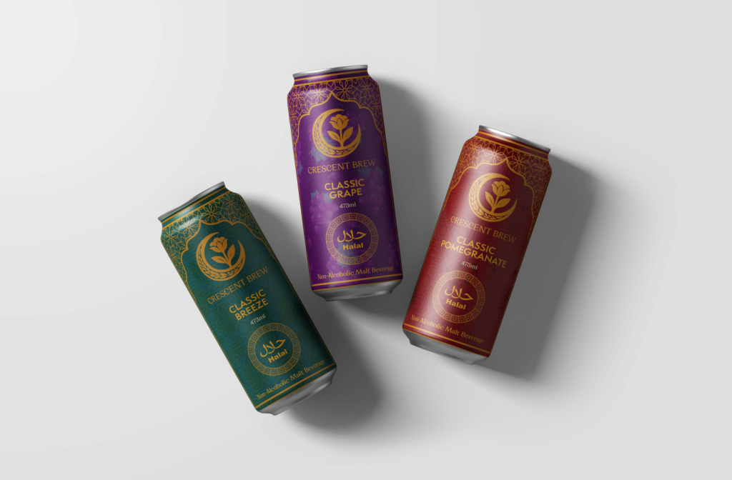
project overview Crescent Brew is a premium halal, non-alcoholic malt beverage concept designed to offer a beer-like experience without alcohol. The project focuses on building a drink brand that feels culturally rooted, modern, and refined, while still being approachable for people who want to socialize and enjoy a crafted beverage without compromising their values. The brand was designed around the idea of celebration without compromise. I wanted Crescent Brew to feel premium and confident, not like a replacement product or something overly plain. The visual identity combines Arabic-inspired details, rich colours, metallic finishes, and elegant can design to create a beverage that feels both traditional and contemporary. Brand concept The main idea behind Crescent Brew is the balance between culture and craft. The drink is positioned for people who want the taste, ritual, and atmosphere of a malt beverage while staying fully halal and alcohol-free. That gave the project a strong purpose beyond just making a nice-looking can. The brand needed to feel respectful and culturally connected, but also modern enough to sit beside other premium beverages. I wanted the design to avoid looking too generic or too traditional, so the direction became a mix of Arabic-inspired ornament, clean branding, and bold shelf presence. Visual identity The Crescent Brew identity is built around the crescent symbol, floral detail, wheat-like forms, and a deep teal and gold colour direction. These elements were chosen to suggest heritage, craft, and elegance without making the brand feel old-fashioned. The logo needed to feel recognizable on a can, but also detailed enough to support the premium tone of the product. The colour palette uses rich jewel-like tones, including deep teal, burgundy, purple, warm gold, and soft beige. These colours help the brand feel luxurious and culturally expressive, while the metallic effect adds a more polished beverage feel. Typography was kept bold and clean enough for readability, with supporting type choices that hint at Arabic-inspired design without becoming too decorative. Product line system The product line uses flavour-based colour variations so each can has its own identity while still belonging to the same brand family. Classic Breeze uses a deep teal direction, Classic Grape uses purple, and Classic Pomegranate uses a rich red tone. Each flavour keeps the same core structure, logo placement, halal mark, and ornamental details, which helps the cans feel consistent as a set. The goal was to make every flavour easy to recognize at a glance. The different base colours create personality, while the repeated layout system keeps the brand unified. This helped Crescent Brew feel like a real product line instead of separate one-off designs. Shelf appeal A big part of the design was making sure the cans could stand out on a shelf. The tall can format, metallic finish, gold details, and dark rich colours were used to make the product feel premium in hand and visually strong from a distance. The halal certification is placed clearly so the audience can immediately understand the product’s value and trust the brand. The Arabic-inspired geometric patterns and flavour colours add detail without making the design feel overcrowded. I wanted the cans to feel special enough for gifting or social occasions, but still practical enough to work as a real beverage brand in stores. Final Reflection Crescent Brew helped me think more deeply about how branding can connect culture, audience, and product purpose. This project was not only about designing a beverage can; it was about creating a brand that could feel premium, halal, modern, and culturally meaningful at the same time. One of the biggest challenges was finding the right balance. If the design became too traditional, it could feel outdated. If it became too modern, it could lose the cultural warmth that made the concept special. Working through the logo, colour palette, typography, and can variations taught me how small design choices can shape the way a product is understood. Overall, Crescent Brew became a strong exercise in beverage branding and visual identity. It pushed me to design with both style and purpose, creating a product system that feels polished, recognizable, and connected to the people it is made for.

Crescent Brew Read More »

screenshot 2026 06 01 015427

When The Petals Fall

project OVERVIEW When the Petals Fall was my second completed novel, but the first one I printed, sold, and published on Amazon. The project began with a self-written story and grew into a full visual communication system, including the book cover, promotional poster, bookmarks, Instagram carousel, social media grid, and web banner. The project was built around quiet emotion and visual softness. Instead of using loud or dramatic visuals, I wanted the design to feel warm, simple, and personal — almost like a memory. Every piece was created to support the tone of the story and make the book feel complete beyond just the manuscript. Story concept At its heart, When the Petals Fall is a story about love, memory, and the small moments that stay with us. Kei and Reina’s connection does not grow through big dramatic scenes, but through quiet comfort, everyday routines, and the slow trust that forms between two people. The title reflects the emotional tone of the story. Like petals falling from a flower, some moments are temporary, but they still leave something behind. I wanted the visual system to carry that same feeling — soft, delicate, slightly bittersweet, and grounded in human connection. Design Direction The cover uses a warm illustrated style to reflect the emotional softness of the story. Kei and Reina are shown in a peaceful spring setting, surrounded by blossoms, calm skies, and gentle light. I wanted the design to feel romantic without being too dramatic, and nostalgic without feeling old-fashioned. The colour palette uses soft pastels and natural tones to create a calm, intimate atmosphere. Floral details, hand-painted textures, and open space help the design feel delicate and personal. The back cover extends the same mood with a blooming orchard and pastel sky, making the full book design feel connected from front to back. promotional system After finishing the book design, I expanded the project into promotional materials for both print and digital use. This included a poster, bookmarks, a web banner, and a structured social media grid. Each piece followed the same visual direction so the campaign felt consistent across different formats. The goal was to make the book recognizable wherever it appeared. The poster introduced the emotional tone of the story, the bookmarks gave the project a physical promotional piece, and the web banner adapted the identity for online use. Together, these pieces helped turn the book into a fuller visual campaign instead of just a standalone cover. Digital extension The digital side of the project included a personality-test style Instagram carousel that extended the book’s soft, introspective tone. The carousel asked gentle questions about memory, peace, and emotion, guiding viewers through a small interactive experience connected to the themes of the novel. The result options, such as “A Brushstroke of Silence” and “The Colour of Us”, were designed to feel poetic and personal. Each frame used muted colours, delicate imagery, and simple layouts so the experience stayed calm, readable, and emotionally connected to the book. Final Reflection This project was special to me because it brought writing and design together in a very personal way. When the Petals Fall started as a story, but through the cover, layout, poster, bookmarks, carousel, and web banner, it became a complete creative project with its own visual identity. Working on it taught me how important tone is when designing around a narrative. The story was quiet and emotional, so the visuals had to support that feeling without overpowering it. I had to think about colour, illustration, spacing, typography, and campaign pieces as parts of the same world. Overall, this project helped me understand how a book can live beyond its pages. It showed me how design can support storytelling, create atmosphere, and make a written piece feel more complete, memorable, and personal.

When The Petals Fall Read More »

blind justice vinyl 2

Blind justice

project overview Blind Justice is a fictional vinyl cover I created around the idea of justice feeling messy instead of clean. I wanted it to look like something intense had just happened, but without explaining the full story. The cover has this heavy, gritty mood — like a crime scene, a fight, or a moment from a city that never really feels safe. For me, the project was less about making a normal album cover and more about creating a feeling. The figure, shadows, red-orange colour, and rough texture all work together to make the design feel loud, tense, and a little uncomfortable. I wanted people to look at it and wonder what kind of music would live inside that world. concept spark The idea came from a fight scene in Daredevil: Born Again that stuck with me. It was quick, rough, and tense, and I loved the shot of Matt jumping in to break the guy’s knees. That frozen moment had so much force in it that I knew I wanted to turn that kind of energy into a vinyl cover. I wanted the design to feel like the music belonged to a story about conflict, pressure, and justice that doesn’t have a simple answer. Instead of making justice look calm or balanced, I wanted the design to feel messy and uncertain. The kind of justice that comes from anger, instinct, and survival, where you’re not fully sure who is right or wrong. Visual Direction The visual direction leans heavily into contrast: light against shadow, movement against stillness, law against chaos. The orange-red colour palette creates heat and urgency, while the dark shadows make the scene feel dangerous and unresolved. Texture was an important part of the design. The grain, rough edges, and distressed treatment give the cover a raw physical quality, almost like a protest poster or old crime print. The typography is bold and direct, stamped into the composition like evidence from a case file. Key visual elements The silhouetted figure creates the main sense of action and impact, while the vertical bars suggest restriction, punishment, and the justice system itself. The composition uses those barriers both as design structure and as metaphor. The parental advisory label adds another layer of realism, helping the fictional album feel like a real music release. It also supports the aggressive tone of the project, making the cover feel more believable as a loud, intense, and emotionally heavy record. Final Reflection This was a fun little project that I really enjoyed working on because it gave me space to create something bold, moody, and cinematic without overthinking it too much. Blind Justice started from one strong visual idea, but it slowly became more about building a whole feeling around that moment. The project helped me see how much story can fit into a single cover design. The figure, bars, colour, texture, and typography all had to suggest a bigger world without explaining everything directly. I wanted the cover to feel intense and a little uncomfortable, like the viewer was catching one frame from a larger story. Working on this also reminded me that not every project needs to be huge to be meaningful. Sometimes a smaller piece can still teach you a lot about atmosphere, symbolism, and visual tension. For me, Blind Justice became a simple but strong experiment in making packaging feel narrative instead of just decorative.

Blind justice Read More »

artboard 3

Lies In The Stars

project overview Lies in the Stars is a conceptual movie poster created from a college brief that asked us to combine a classic Disney story with a completely different genre. My concept was Pinocchio meets sci-fi, but instead of making it playful or fantasy-like, I pushed the story into a darker psychological world. The poster reimagines Pinocchio as a synthetic being trapped in a future controlled by programming, surveillance, and manipulation. The original idea of wanting to become “real” becomes less about becoming human and more about wanting freedom in a system that refuses to let him choose. concept origin The original story of Pinocchio is about identity, morality, and the desire to become real. I wanted to keep those themes, but translate them into a world shaped by technology and control. Instead of strings made from wood and thread, the puppet is controlled by invisible systems, data, and a larger force watching from above. That question became the base of the design: what if the puppet was not only a character, but a metaphor for someone trapped inside a programmed world? Visual Direction The visual direction combines sci-fi atmosphere with horror-inspired tension. I used a dark colour palette, red lighting, cosmic textures, and a large wireframe hand to create a feeling of control and unease. The poster is not meant to explain everything directly. It uses mood, symbolism, and negative space to let the viewer feel the story before fully understanding it. The typography was designed to feel cinematic and slightly unsettling, connecting the poster to old sci-fi and horror film language while still feeling modern. Key visual elements The main wireframe hand represents control. It reaches down from above like a programmer, creator, or manipulative force, pulling the puppet through invisible strings. The puppet figure is cold and synthetic, showing innocence turned into something artificial and controlled. The space setting adds another layer to the concept. It makes the story feel distant, lonely, and larger than one character. The red tones suggest danger, fear, and emotional isolation, while the darker background helps the poster feel quiet and tense. Small details like binary code and constellation-like patterns hint at hidden systems behind the story. Final Reflection This project helped me understand how a familiar story can be completely transformed through genre, tone, and visual symbolism. Instead of simply placing Pinocchio into a sci-fi setting, I wanted the design to reinterpret the meaning of the story. The puppet became a symbol of control, lost autonomy, and the fear of being shaped by a system you cannot escape. Working on Lies in the Stars pushed me to think more conceptually. Every visual choice had to support the darker version of the story, from the red colour palette and cosmic setting to the wireframe hand and cinematic typography. It taught me that a poster does not need to explain everything clearly to be effective. Sometimes the strongest design leaves space for the viewer to connect the meaning themselves.

Lies In The Stars Read More »

farisfaris bubblium brand asset mockup 4 nov24

Bubblium

concept overview Bubblium is a fictional sparkling water brand created for Gen Z and Millennials. Instead of following the clean, quiet style often seen in beverage branding, this project leans into personality, humour, colour, and unexpected flavour combinations. The goal was to make the brand feel less like a basic drink and more like a playful experience people would want to notice, try, and share. The concept was built around the idea of “zany refreshment.” Every part of the brand, from the name to the packaging and campaign pieces, was designed to feel energetic and a little unusual while still staying clear and recognizable. Bubblium became a full brand world, not just a logo or can design. Brand world The brand personality is playful, curious, adventurous, and social. Bubblium is meant to feel bold and unexpected, but still approachable enough for everyday use. It uses unusual flavour ideas, bright gradients, bubbly graphic patterns, and a cheerful tone of voice to create a brand that feels lively from every angle. A big part of the project was making sure the chaos stayed controlled. The visuals needed to feel fun, but not random. The flavour names, colour palettes, typography, labels, and digital pieces all had to feel connected, so the brand could be expressive without losing consistency. Visual identiy The visual identity was designed to feel bubbly, colourful, and slightly strange in a fun way. The logo uses soft rounded forms and gradient colours to reflect movement, flavour, and carbonation. The supporting graphics use bubbles, fruit-inspired patterns, and flowing wave shapes to create a sense of energy across the brand. Typography also played an important role in giving Bubblium its personality. The type needed to feel playful enough for the brand voice, but still readable across packaging, posters, social media, and digital applications. The result is a system that feels light, expressive, and flexible across different formats. Packaging became one of the strongest parts of the project. Each flavour was given its own colour direction, gradient mood, and label treatment while still following the same brand structure. This helped each can feel collectible and different, while still belonging to the same Bubblium family. Digital and print applications After building the core identity and packaging, I expanded the brand into digital and print applications. This included social media pieces, billboard-style mockups, branded merchandise, posters, stickers, badges, and other promotional items. The purpose was to show how Bubblium could live beyond the can and become a fuller brand experience. Each application was designed to feel connected but not repetitive. Some pieces focused more on the product, while others pushed the playful brand voice through bold type, bright colour, and strange flavour-driven messaging. This helped the brand feel flexible across different platforms while still keeping the same energetic personality. Motion & campaign The motion and campaign pieces were created to give Bubblium a stronger sense of rhythm and movement. I designed short digital ads that could work for platforms like TikTok and Instagram, using animated typography, flavour splash transitions, product flashes, and quick brand moments. This part of the project helped the brand feel more alive. Since Bubblium is built around energy, fizz, and personality, motion gave the identity another layer. The campaign pieces show how the brand could catch attention quickly while still keeping the same playful visual language. Label & packaging system The label system was created to make each flavour feel like its own small world. The dual-gradient backgrounds represent the mood of each flavour, while illustrated fruit patterns and wave textures add movement and texture. The centred logo keeps the brand recognizable, and the flavour names stay bold enough to stand out on a shelf. I also added real-world packaging details like nutrition panels, ingredient lists, barcodes, and bilingual information to make the fictional brand feel more believable. These small details helped the project move beyond decoration and feel closer to a complete product system. https://ffaris.vccdigitalmedia.ca/Digiversely/wp-content/uploads/2026/06/Bubblium-Dynamic-Express-AD.mp4https://ffaris.vccdigitalmedia.ca/Digiversely/wp-content/uploads/2026/06/Bubblium-Ad.mp4 Final Reflection Bubblium challenged me to think about branding as a full world instead of a single visual style. It was not enough to make the logo or labels look colourful; the whole brand had to feel consistent across packaging, social media, print, merchandise, and motion. Every piece needed to feel like it came from the same personality, even when the designs were loud, playful, and intentionally unusual. This project also taught me how to balance creativity with structure. Because the brand is based on weird flavours, humour, and visual energy, it could easily become messy. I had to create enough rules through typography, colour, layout, and recurring graphic elements so the brand could stay recognizable while still feeling fun. Overall, Bubblium became one of my strongest examples of building a complete brand system. It helped me understand how visual identity can create a mood, how packaging can carry personality, and how a fictional product can feel believable when every detail supports the same idea.

Bubblium Read More »

the house that knows mockup 3

The House That Knows

OVERVIEW This was my first ever novel—a deeply personal dive into fiction, memory, and visual storytelling. I didn’t just want to write a book, I wanted to design a world around it. The House That Knows began as a simple story idea, but quickly grew into a full creative project that blended writing, layout design, and branding. From the manuscript to the final cover and even a fictional movie campaign, this project became my way of exploring how narrative and design can work hand in hand to build something haunting and whole. Concept Overview The House That Knows is a slow-burning psychological thriller about memory, trauma, and the spaces that never truly let us go. The story follows Nathan and Kate, siblings returning to their decaying childhood home to confront a past that’s been waiting. This wasn’t just a novel—it was a full visual narrative system. Alongside writing the manuscript, I designed the book layout, created the cover, and developed an entire fictional film campaign to explore how the story might live on screen. Story summary As Nathan and Kate begin peeling back the layers of their old home, memories resurface—some real, some imagined. The deeper they explore, the more the house begins to “remember” with them. Silence becomes a language. Shadows become familiar. And the truth? It’s far from comforting. Some houses don’t forget. Expanding the Narrative While the book stood on its own as a complete narrative, I wanted to push its emotional reach further. That meant imagining how the story could live beyond the page—how its haunting tone, slow tension, and psychological themes could translate across mediums. This led to the idea of building a fictional film campaign, not just as an exercise in design, but as a deeper expansion of the story’s atmosphere and visual language. Expanding the Narrative While the book stood on its own as a complete narrative, I wanted to push its emotional reach further. That meant imagining how the story could live beyond the page—how its haunting tone, slow tension, and psychological themes could translate across mediums. This led to the idea of building a fictional film campaign, not just as an exercise in design, but as a deeper expansion of the story’s atmosphere and visual language. Fictional Movie Adaptation To imagine the novel as a feature film, I created a full visual campaign: 5 Poster Designs: Symbolic, cinematic visuals aligned with horror themes 3 Instagram Carousels: Mini storytelling sequences teasing the plot Each piece carried the story’s tone across platforms, building a consistent identity for a fictional adaptation. Final Reflection This was my second novel, but it was the first time I treated a story as a complete visual system instead of only a written piece. The House That Knows pushed me to think beyond the manuscript and explore how a narrative can live through design, from the book cover and layout to a fictional movie campaign, posters, banners, and social media pieces. Working on this project taught me how important tone is across every creative decision. The story is slow, psychological, and unsettling, so every visual choice had to support that atmosphere instead of simply looking dramatic. I had to think about colour, typography, imagery, pacing, and composition as parts of the same world. This project also helped me understand how writing and design can strengthen each other. The writing gave the visuals emotional direction, while the design made the story feel more real, complete, and immersive. Overall, it became a project about building a world around a narrative and learning how to carry one idea across different formats while keeping it consistent, intentional, and connected.

The House That Knows Read More »