project overview
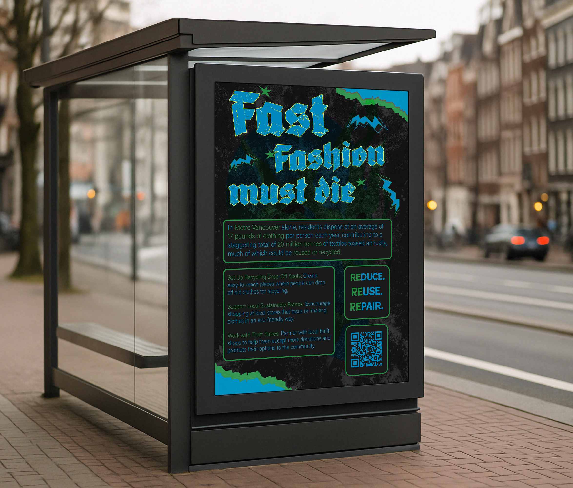
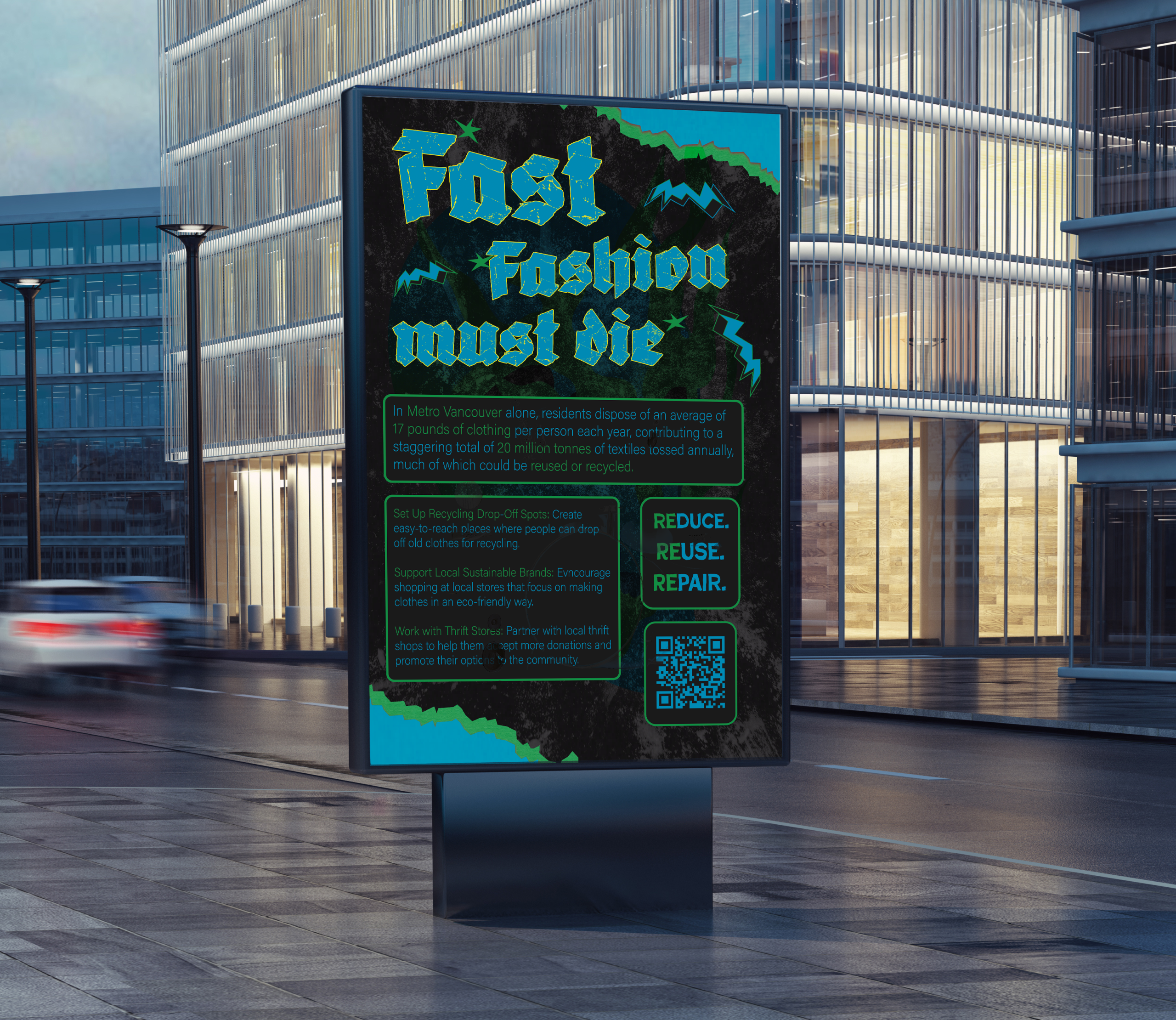
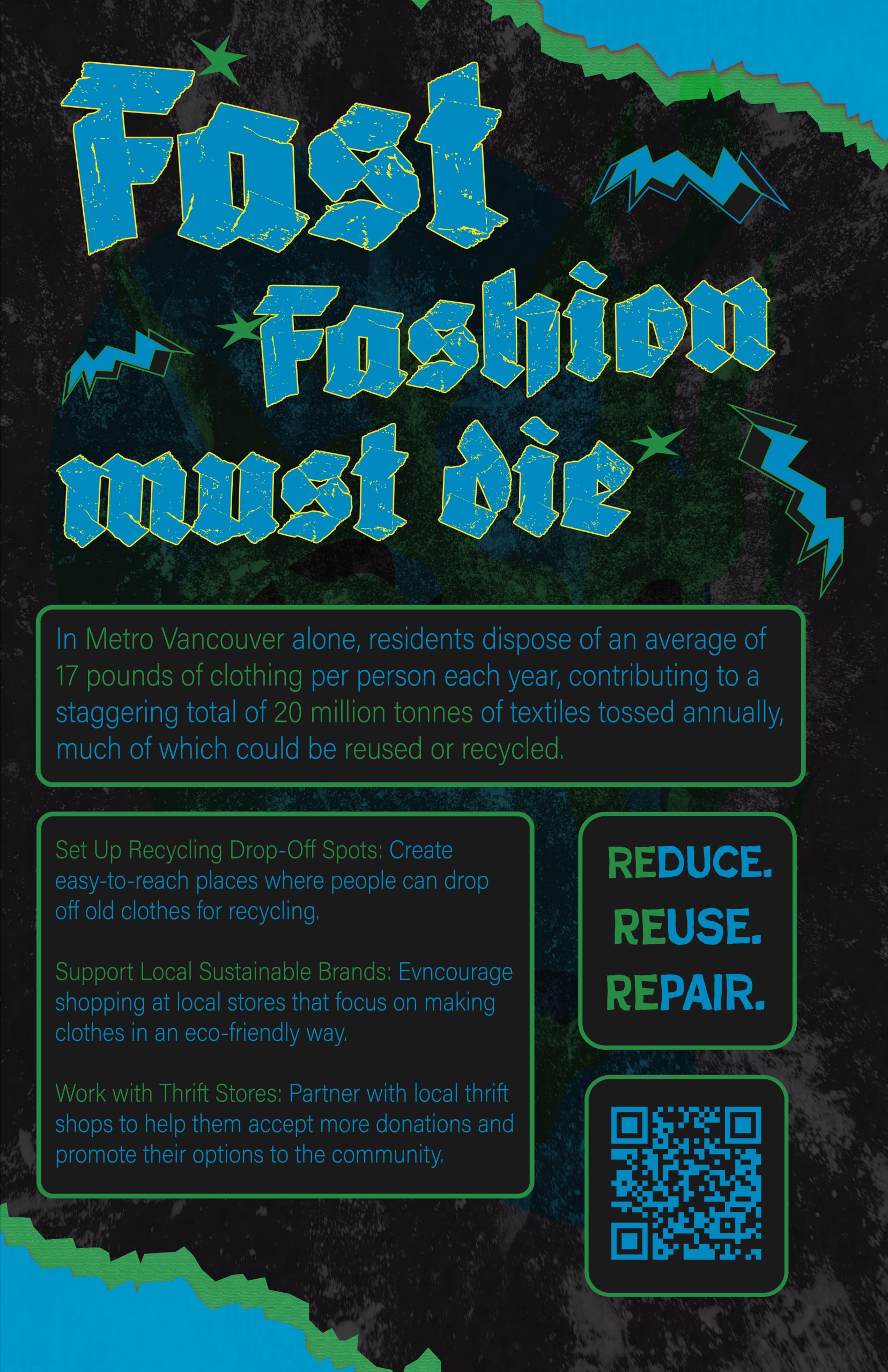
Fast Fashion Must Die is an awareness poster created around the waste and overconsumption caused by the fast fashion industry. The project focuses on how clothing is often treated as disposable, even though textile waste has a real impact on local communities and the environment.
Instead of making the poster feel soft or overly clean, I wanted it to feel loud and uncomfortable. The title is direct on purpose. It is meant to stop the viewer for a second and make the issue feel urgent, not distant.
Design Approach
For the visual direction, I moved away from the usual natural, minimal look often used in sustainability design. I wanted the poster to feel more punk, rough, and rebellious because the message itself is frustrated. The distressed typography, dark texture, electric blue, and toxic green all work together to create a feeling of pollution, urgency, and resistance.
The layout is information-heavy, but I still wanted it to feel energetic. The poster includes statistics, local context, possible solutions, and a QR code, so it works both as a visual statement and as a practical awareness piece.
message & purpose
The goal of this project was not just to tell people that fast fashion is harmful, but to give the message more attitude and action. I wanted the poster to speak to a younger audience in a way that felt bold, direct, and harder to ignore.
The solutions on the poster keep the campaign grounded. Instead of only showing the problem, it points toward small local actions like clothing recycling drop-offs, supporting sustainable brands, and working with thrift shops. That helped the poster feel less like a warning and more like a call to do something.
Key visual elements
The distressed gothic lettering was chosen to make the poster feel more aggressive and anti-establishment, almost like a protest flyer. The electric blue and green colour palette creates a toxic, high-energy look that connects to pollution, waste, and urgency.
The torn textures and block-based text sections help the poster feel raw while still keeping the information readable. The QR code adds a functional element, turning the design from only a visual statement into something viewers can actually interact with.
Final Reflection
This project was a good challenge because it pushed me to design an awareness poster that did not feel too safe or predictable. Sustainability design is often calm, clean, and nature-focused, but I wanted this poster to feel more angry and urgent because the issue itself is not gentle.
Working on Fast Fashion Must Die helped me think about how tone changes the way people receive information. The poster had to include facts and solutions, but it also needed enough visual energy to make someone stop and actually look at it. Balancing those two things was the main challenge.
Overall, this project taught me that awareness design can still have personality. It can be informative without being boring, and it can be loud without losing its message. For me, the poster became a way to turn frustration into something visual, direct, and useful.