concept overview
Haruki Threads is a conceptual slow fashion brand inspired by Japanese culture, nature, and quiet elegance. The project started with developing the brand name and grew into a full visual identity system, including the logo, colour palette, typography, style guide, and real-world mockups.
The goal was to create a fashion label that felt calm, refined, and rooted in meaning. I wanted the brand to feel natural and modern without becoming too trendy or overly minimal. Every part of the identity was designed to support a sense of balance, softness, and lasting quality.
NAMING THE BRAND
The name “Haruki” means spring tree, which connects to ideas of growth, renewal, and natural beauty. Paired with “Threads,” the name becomes a fashion brand that feels gentle but still memorable.
I explored different name directions before choosing Haruki Threads because it had the strongest connection to the brand’s mood. It felt elegant, simple, and meaningful without needing too much explanation. The name gave the project a clear foundation before I moved into the visual identity.
Visual identiy
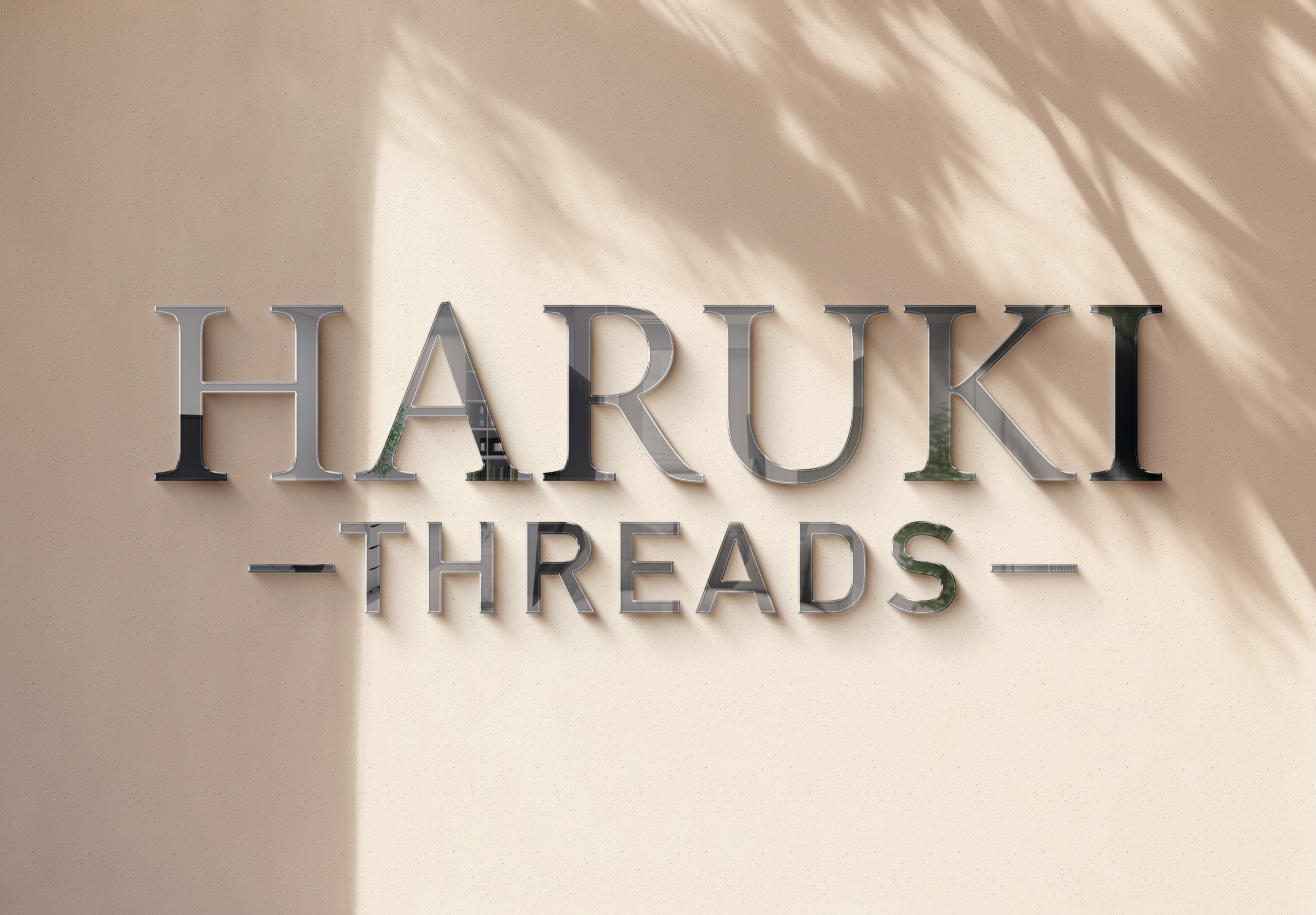
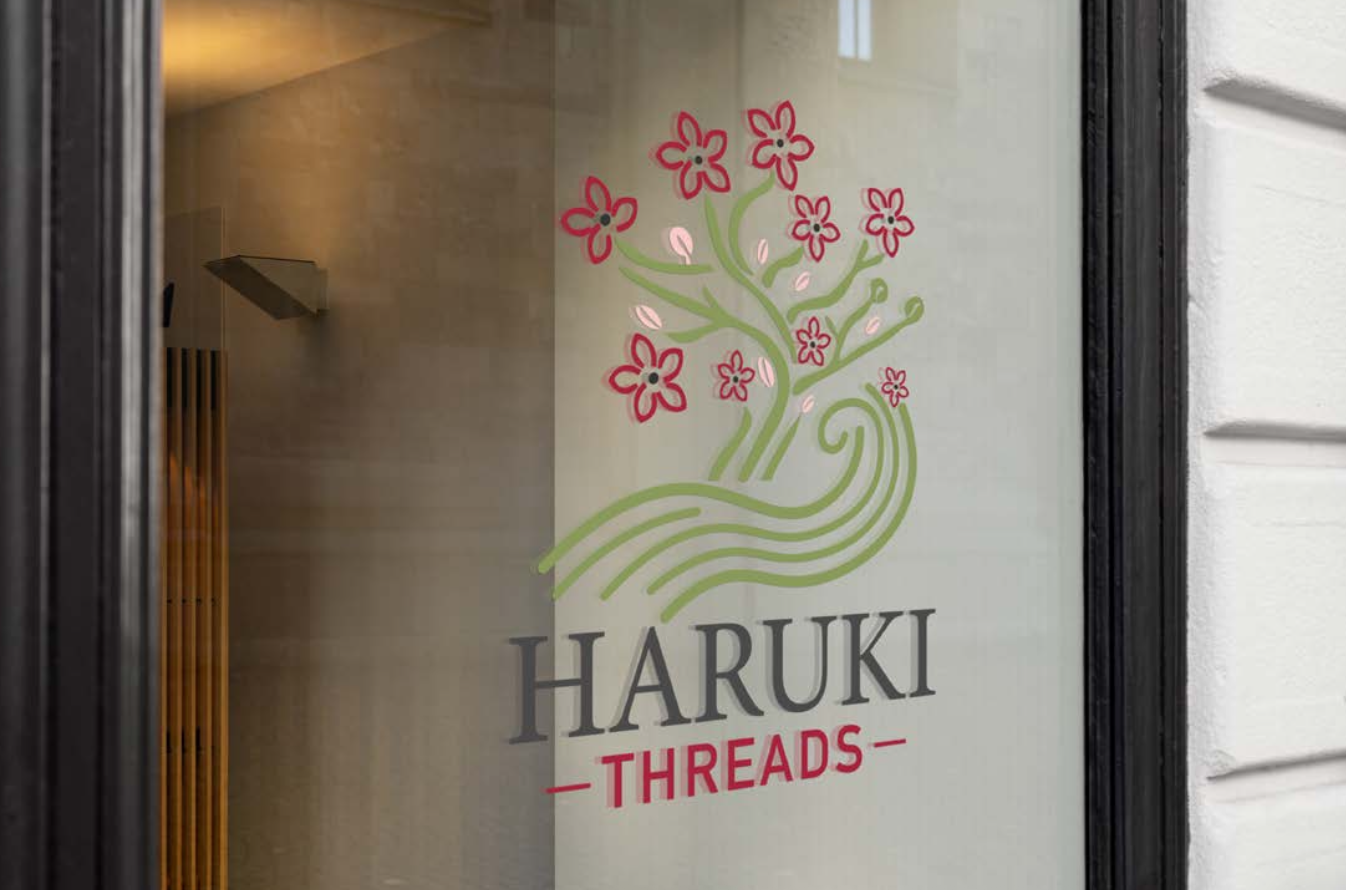
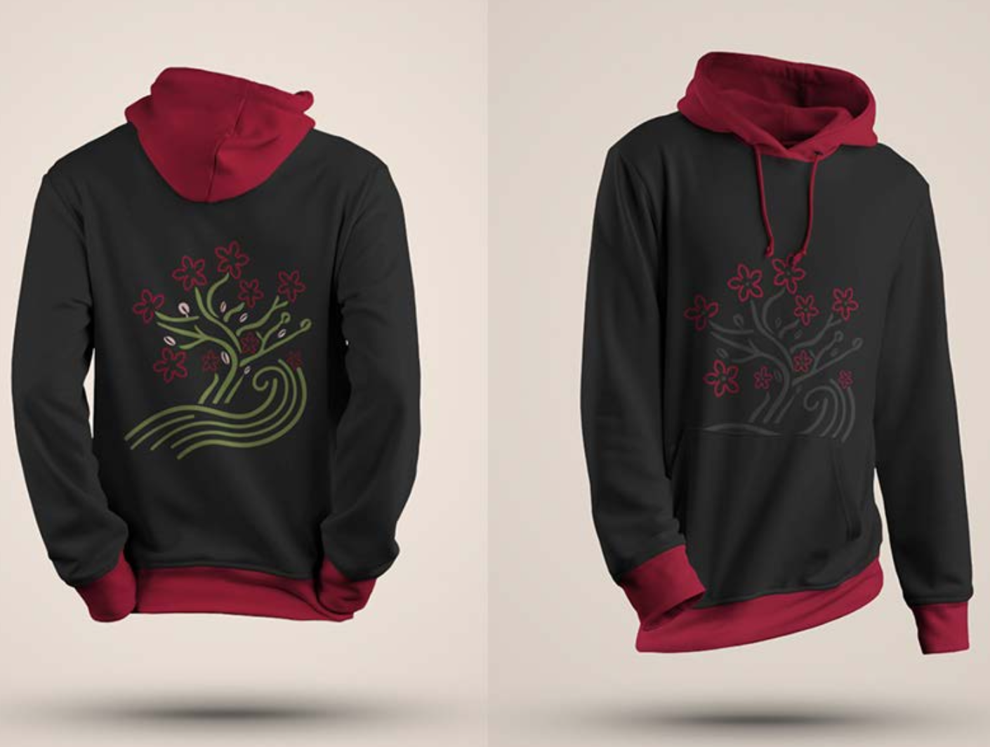
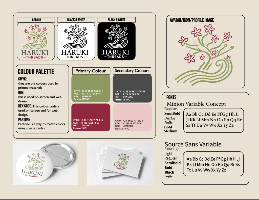
The visual identity is built around nature, balance, and softness. The logo combines flowing lines, tree-like branches, blossom details, and a calm wave form to create a mark that feels organic and graceful. I wanted it to feel connected to fashion, but also to the feeling of nature and slow living.
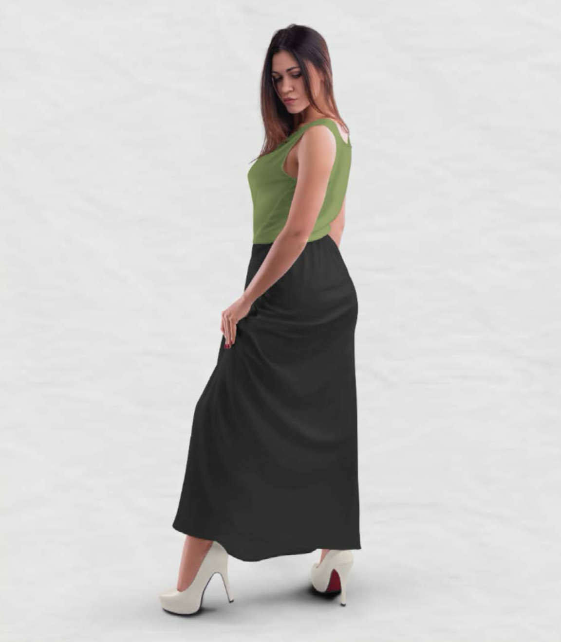
The colour palette uses warm neutrals and nature-inspired tones, including soft green, cherry blossom red, blush pink, and grounding charcoal. These colours help the brand feel peaceful and seasonal while still giving it enough contrast to work across different applications.
Typography was kept simple and refined. The serif typeface gives the brand a more timeless and elegant feeling, while the supporting sans-serif keeps the system clean and readable. Together, the type choices help the brand feel both traditional and modern.
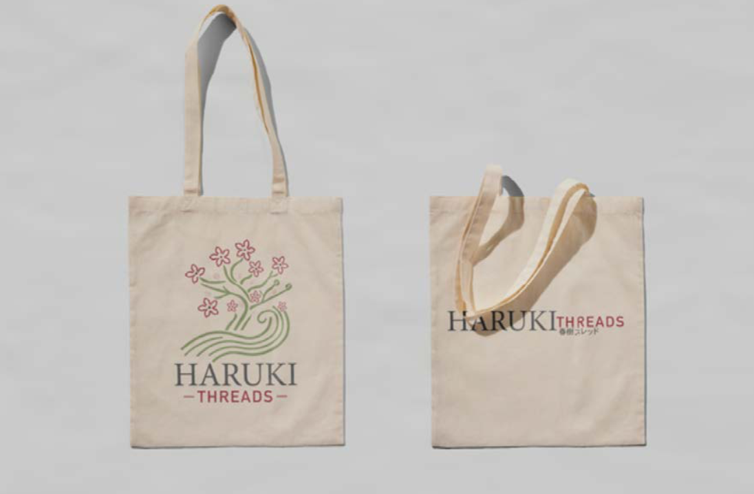
bRAND APPLICATIONS
After creating the logo and style guide, I applied the identity across different touchpoints to see how the brand could live in the real world. This included storefront signage, tote bags, stationery, buttons, clothing mockups, and apparel pieces like hoodies and dresses.
These applications helped test whether the identity could stay consistent across different materials and surfaces. The logo needed to feel strong on glass, fabric, paper, and packaging without losing its calm and delicate quality. Seeing the brand applied across physical items made the concept feel more complete and believable.

Final Reflection
Haruki Threads was my first proper branding project, so it helped me understand how much goes into building an identity from the ground up. It was not just about designing a logo. I had to think about the name, meaning, colours, typography, applications, and how every piece worked together as one brand.
This project taught me how important intention is in branding. Because the brand was inspired by Japanese culture and nature, I had to be careful not to make it feel like a cliché. I wanted the design to feel respectful, calm, and meaningful while still being modern enough for a fashion label.
Working on Haruki Threads gave me a stronger understanding of how a brand can carry a feeling across many different touchpoints. From the logo to the clothing and packaging mockups, every piece had to support the same quiet, natural identity. It became the project that helped shape how I approach branding today.