project overview
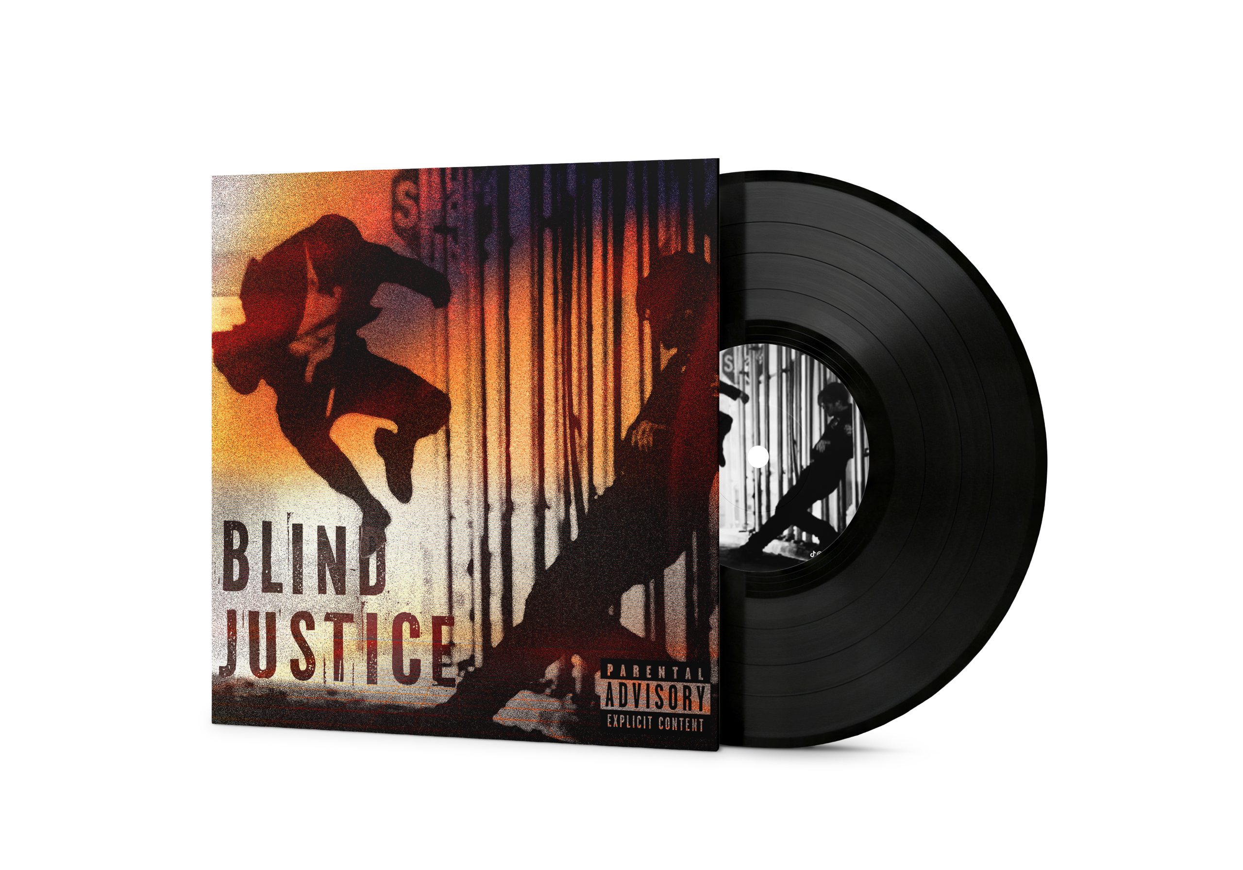
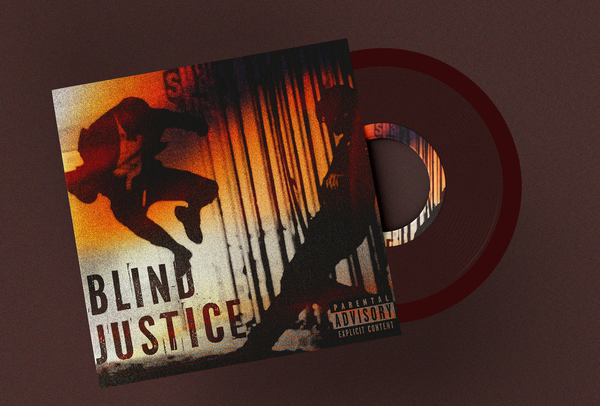
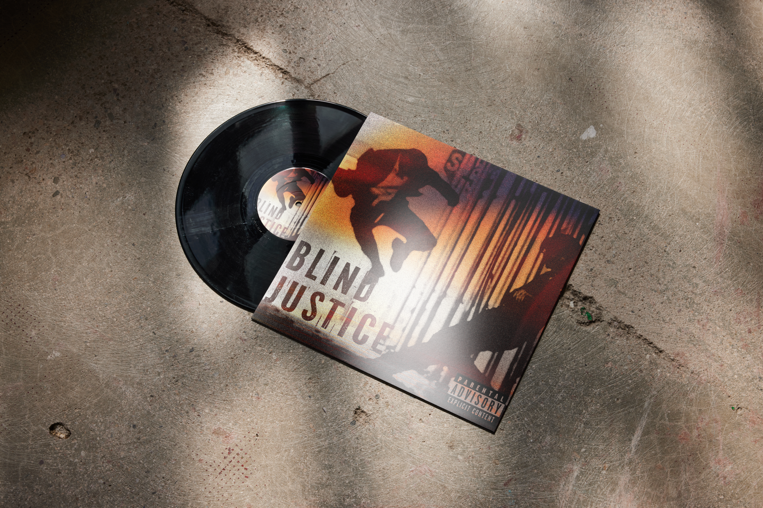
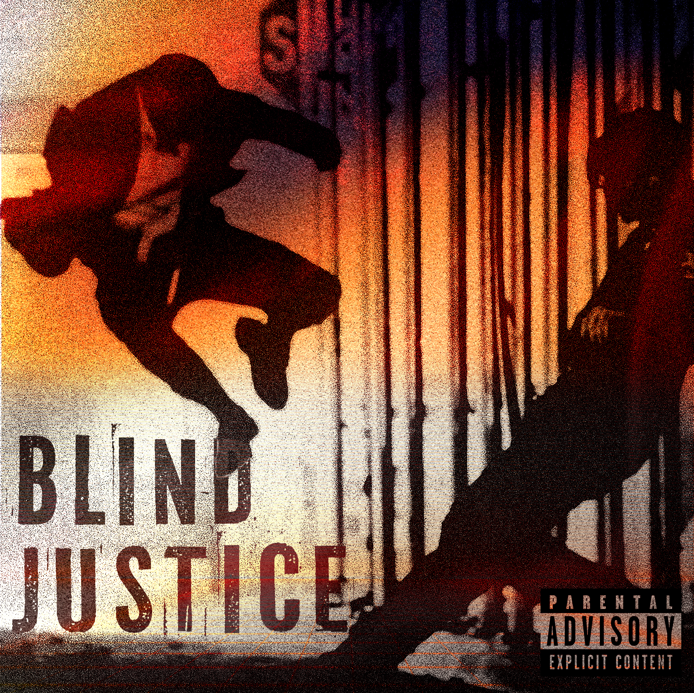
Blind Justice is a fictional vinyl cover I created around the idea of justice feeling messy instead of clean. I wanted it to look like something intense had just happened, but without explaining the full story. The cover has this heavy, gritty mood — like a crime scene, a fight, or a moment from a city that never really feels safe.
For me, the project was less about making a normal album cover and more about creating a feeling. The figure, shadows, red-orange colour, and rough texture all work together to make the design feel loud, tense, and a little uncomfortable. I wanted people to look at it and wonder what kind of music would live inside that world.
concept spark
The idea came from a fight scene in Daredevil: Born Again that stuck with me. It was quick, rough, and tense, and I loved the shot of Matt jumping in to break the guy’s knees. That frozen moment had so much force in it that I knew I wanted to turn that kind of energy into a vinyl cover. I wanted the design to feel like the music belonged to a story about conflict, pressure, and justice that doesn’t have a simple answer.
Instead of making justice look calm or balanced, I wanted the design to feel messy and uncertain. The kind of justice that comes from anger, instinct, and survival, where you’re not fully sure who is right or wrong.
Visual Direction
The visual direction leans heavily into contrast: light against shadow, movement against stillness, law against chaos. The orange-red colour palette creates heat and urgency, while the dark shadows make the scene feel dangerous and unresolved.
Texture was an important part of the design. The grain, rough edges, and distressed treatment give the cover a raw physical quality, almost like a protest poster or old crime print. The typography is bold and direct, stamped into the composition like evidence from a case file.
Key visual elements
The silhouetted figure creates the main sense of action and impact, while the vertical bars suggest restriction, punishment, and the justice system itself. The composition uses those barriers both as design structure and as metaphor.
The parental advisory label adds another layer of realism, helping the fictional album feel like a real music release. It also supports the aggressive tone of the project, making the cover feel more believable as a loud, intense, and emotionally heavy record.
Final Reflection
This was a fun little project that I really enjoyed working on because it gave me space to create something bold, moody, and cinematic without overthinking it too much. Blind Justice started from one strong visual idea, but it slowly became more about building a whole feeling around that moment.
The project helped me see how much story can fit into a single cover design. The figure, bars, colour, texture, and typography all had to suggest a bigger world without explaining everything directly. I wanted the cover to feel intense and a little uncomfortable, like the viewer was catching one frame from a larger story.
Working on this also reminded me that not every project needs to be huge to be meaningful. Sometimes a smaller piece can still teach you a lot about atmosphere, symbolism, and visual tension. For me, Blind Justice became a simple but strong experiment in making packaging feel narrative instead of just decorative.