project overview
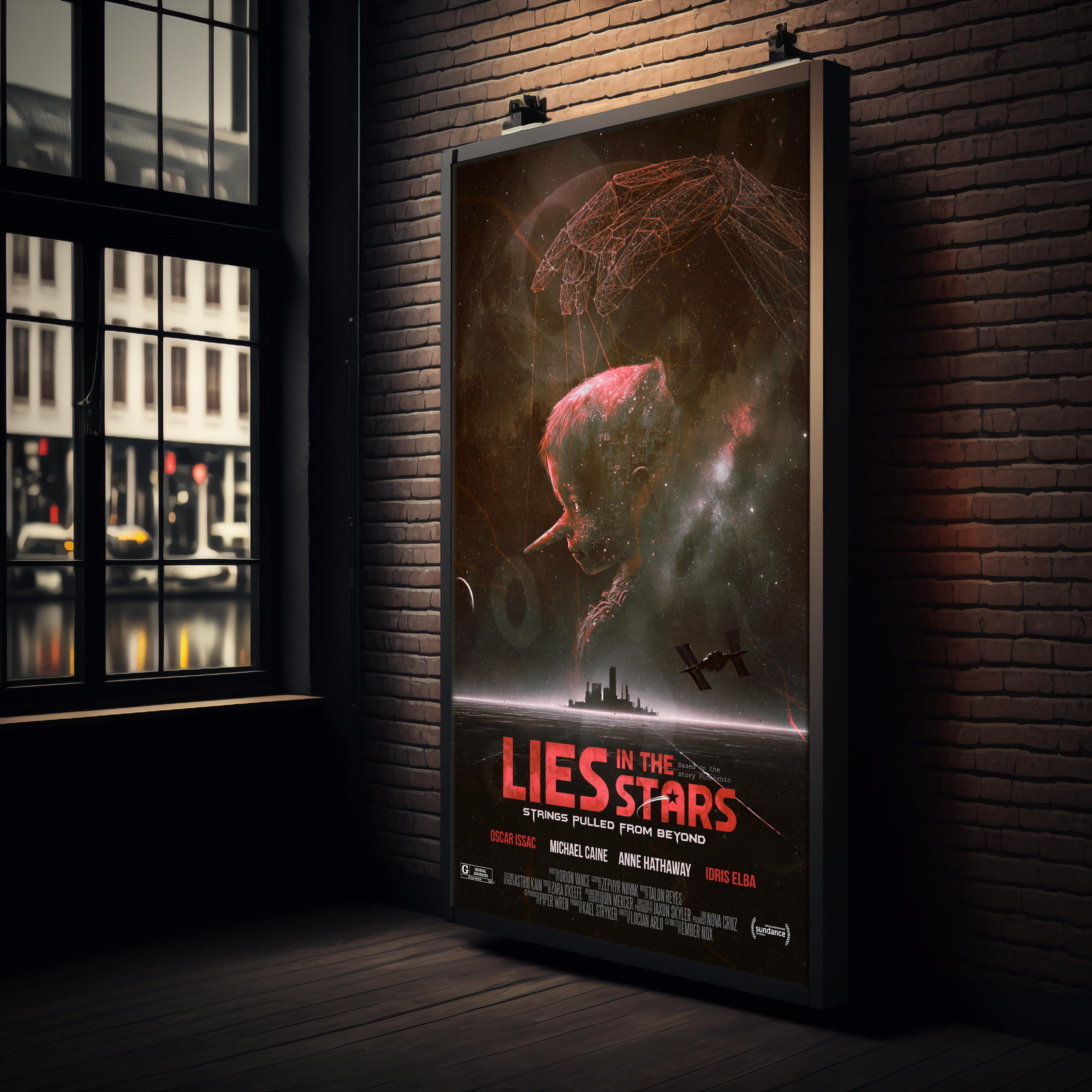
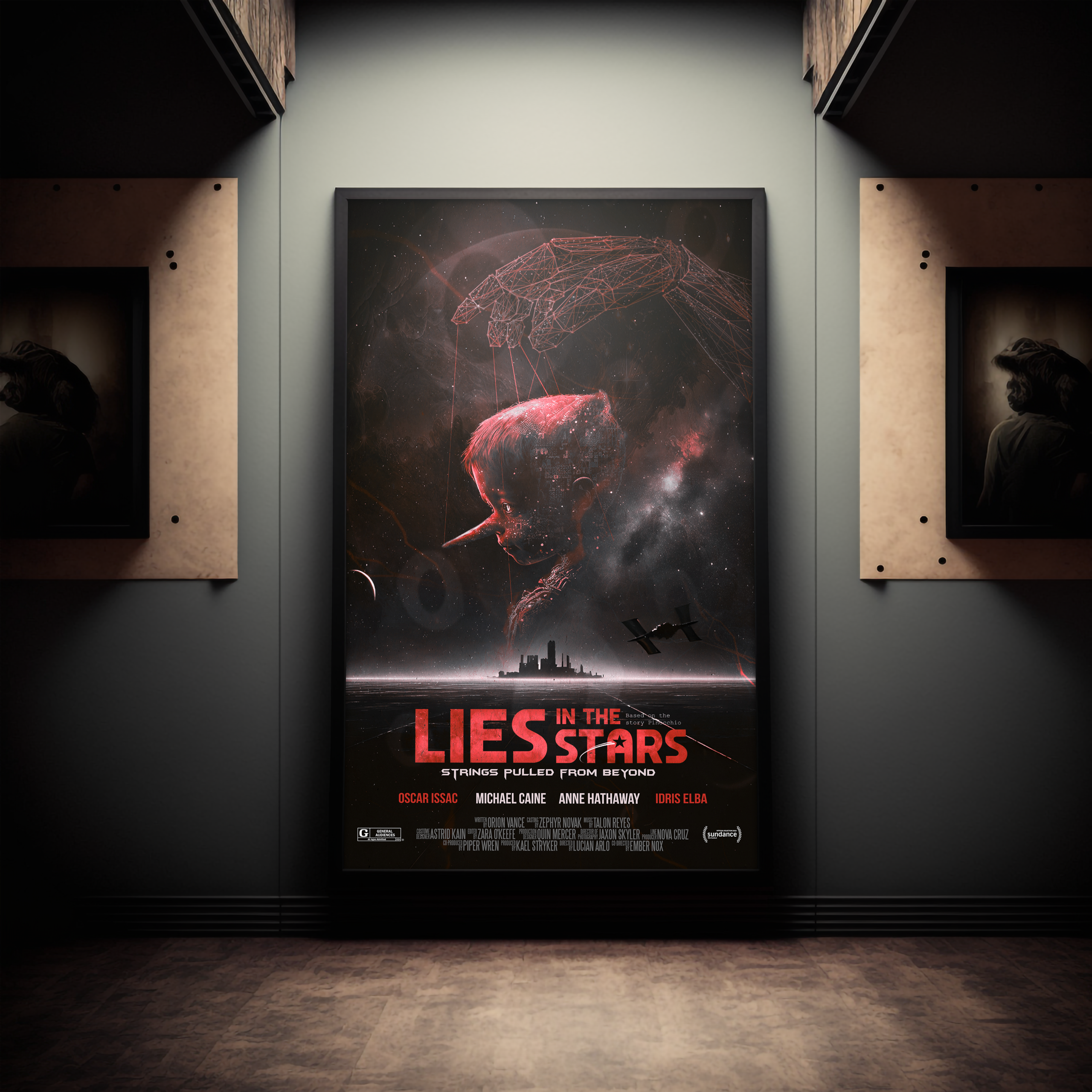
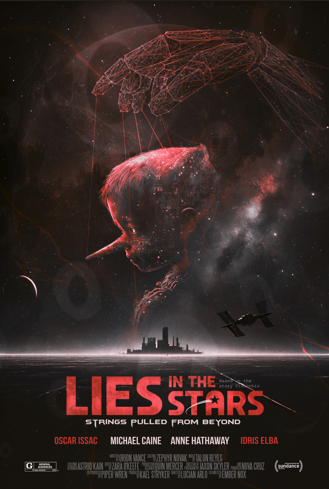
Lies in the Stars is a conceptual movie poster created from a college brief that asked us to combine a classic Disney story with a completely different genre. My concept was Pinocchio meets sci-fi, but instead of making it playful or fantasy-like, I pushed the story into a darker psychological world.
The poster reimagines Pinocchio as a synthetic being trapped in a future controlled by programming, surveillance, and manipulation. The original idea of wanting to become “real” becomes less about becoming human and more about wanting freedom in a system that refuses to let him choose.
concept origin
The original story of Pinocchio is about identity, morality, and the desire to become real. I wanted to keep those themes, but translate them into a world shaped by technology and control. Instead of strings made from wood and thread, the puppet is controlled by invisible systems, data, and a larger force watching from above.
That question became the base of the design: what if the puppet was not only a character, but a metaphor for someone trapped inside a programmed world?
Visual Direction
The visual direction combines sci-fi atmosphere with horror-inspired tension. I used a dark colour palette, red lighting, cosmic textures, and a large wireframe hand to create a feeling of control and unease. The poster is not meant to explain everything directly. It uses mood, symbolism, and negative space to let the viewer feel the story before fully understanding it.
The typography was designed to feel cinematic and slightly unsettling, connecting the poster to old sci-fi and horror film language while still feeling modern.
Key visual elements
The main wireframe hand represents control. It reaches down from above like a programmer, creator, or manipulative force, pulling the puppet through invisible strings. The puppet figure is cold and synthetic, showing innocence turned into something artificial and controlled.
The space setting adds another layer to the concept. It makes the story feel distant, lonely, and larger than one character. The red tones suggest danger, fear, and emotional isolation, while the darker background helps the poster feel quiet and tense. Small details like binary code and constellation-like patterns hint at hidden systems behind the story.
Final Reflection
This project helped me understand how a familiar story can be completely transformed through genre, tone, and visual symbolism. Instead of simply placing Pinocchio into a sci-fi setting, I wanted the design to reinterpret the meaning of the story. The puppet became a symbol of control, lost autonomy, and the fear of being shaped by a system you cannot escape.
Working on Lies in the Stars pushed me to think more conceptually. Every visual choice had to support the darker version of the story, from the red colour palette and cosmic setting to the wireframe hand and cinematic typography. It taught me that a poster does not need to explain everything clearly to be effective. Sometimes the strongest design leaves space for the viewer to connect the meaning themselves.