campaign overview
Break the Bind is a men’s mental health awareness campaign built around the pressure many men feel to stay silent, composed, or “strong” even when they are struggling. The project uses posters, digital ads, and social media storytelling to challenge those expectations and create a message that feels direct, emotional, and easy to connect with.
Rather than treating awareness as a one-time message, the campaign focuses on long-term emotional openness. It encourages men to speak honestly, ask for support, and understand that vulnerability is not a weakness. The visual direction was designed to feel bold and human, using strong contrast, expressive imagery, and short messages that can hold attention quickly.
The Core message
The main concept behind the campaign is the idea of breaking away from emotional silence. The “bind” represents the invisible pressure created by phrases like “man up,” “don’t cry,” or “deal with it.” These expectations can make it harder for men to talk about fear, sadness, anxiety, or loneliness.
The campaign’s goal was to turn that hidden struggle into something visible. Each design piece explores a different part of that emotional experience, from masking pain in public to feeling alone privately. The work was created to feel supportive without becoming soft or overly polished — serious, but still approachable.
Visual Direction
The visual style was built to feel intense but controlled. I used bold colours, strong contrast, layered typography, and emotional image treatment to reflect the tension between what someone shows on the outside and what they may be feeling inside. The designs needed to be eye-catching, but they also had to carry the seriousness of the topic.
A lot of the campaign depends on emotional balance. If the visuals were too clean, the message could feel distant. If they were too chaotic, the message could become hard to read. I wanted the final pieces to sit somewhere in between — visually strong, but still clear enough for someone to understand quickly.
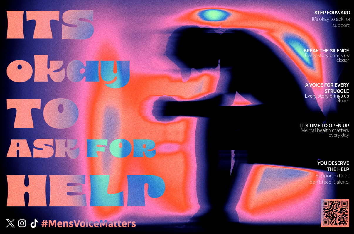
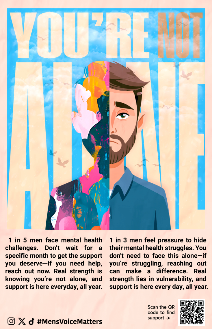
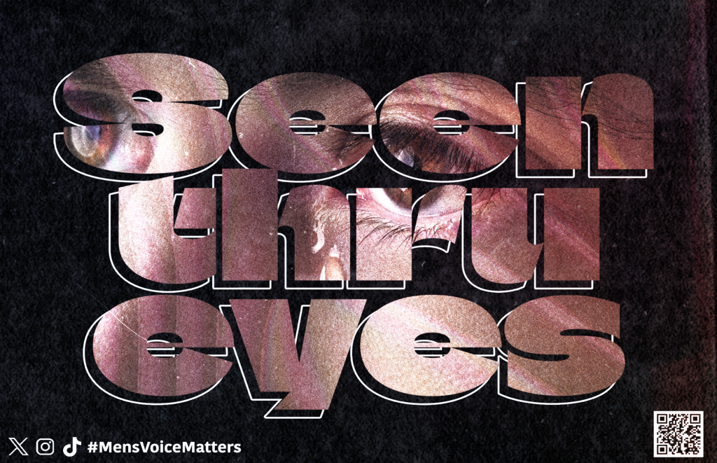
Poster series
The poster series was designed to show different sides of men’s mental health. One poster focuses on the difficulty of asking for help, using shadow and heatmap-like tones to show emotional pressure. Another focuses on silent pain through close portrait framing and visual tension. A third poster explores the feeling of appearing calm on the outside while dealing with inner chaos.
Each poster uses a short, direct message so the viewer can understand the idea quickly. I also included QR code support elements so the campaign could move beyond awareness and point people toward real resources. That was important because the goal was not only to create emotional visuals, but to make the work feel useful as well.

Outcome
Break the Bind became a multi-platform awareness campaign that used posters, digital pieces, and social storytelling to speak about men’s mental health in a more honest way. The project helped me understand how design can carry emotion while still being practical and clear.
It also taught me how sensitive topics need careful visual decisions. The work had to feel bold enough to get attention, but respectful enough to support the message. Through this project, I learned that awareness design is not only about making people notice something — it is also about making them feel understood.
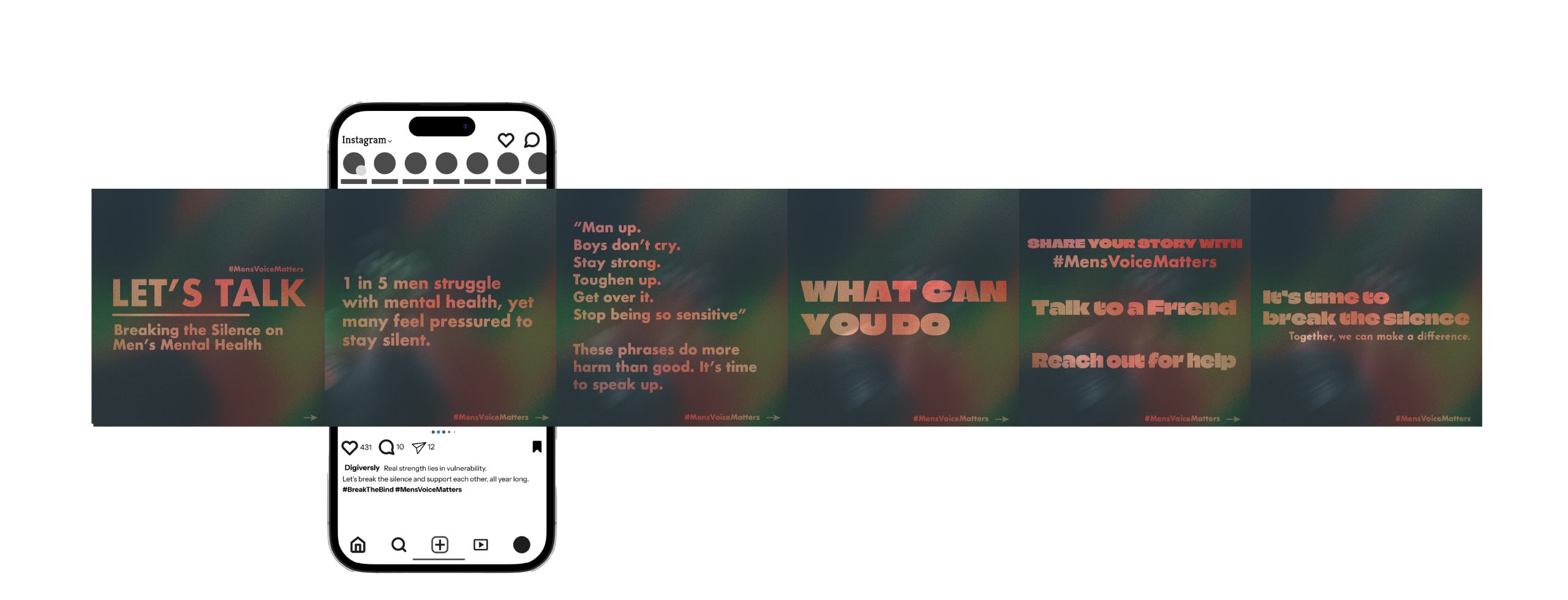
Social Storytelling
Alongside the posters, I created an Instagram carousel called Beyond the Brave Face. This part of the campaign was quieter and more personal. Instead of using one bold message, the carousel moves through a small emotional sequence, guiding the viewer from pressure and silence toward recognition and support.
The final slide uses the hashtag #MensVoiceMatters as an open invitation for shared stories. I wanted the carousel to feel like something someone could come across privately in their feed and still feel seen by. It was less about shouting the message and more about creating a small moment of connection.
Final Reflection
This project was important to me because it was one of the first times I used design to speak about something deeply personal and socially meaningful. Men’s mental health is often surrounded by silence, pressure, and shame, so I wanted the campaign to feel honest rather than decorative.
Working on Break the Bind taught me that emotional design needs responsibility. Every colour, phrase, image, and layout choice had to support the message without making it feel forced or performative. I had to think about how someone might feel when they saw the work, especially if they were dealing with the same struggles privately.
The project helped me see design as more than visual expression. It can be a way to open conversations, challenge harmful ideas, and create a small space where people feel less alone. Overall, Break the Bind became a campaign about turning silence into something visible, direct, and human.