Overview
This was my first ever novel—a deeply personal dive into fiction, memory, and visual storytelling. I didn’t just want to write a book, I wanted to design a world around it. The House That Knows began as a simple story idea, but quickly grew into a full creative project that blended writing, layout design, and branding. From the manuscript to the final cover and even a fictional movie campaign, this project became my way of exploring how narrative and design can work hand in hand to build something haunting and whole.
Concept Overview
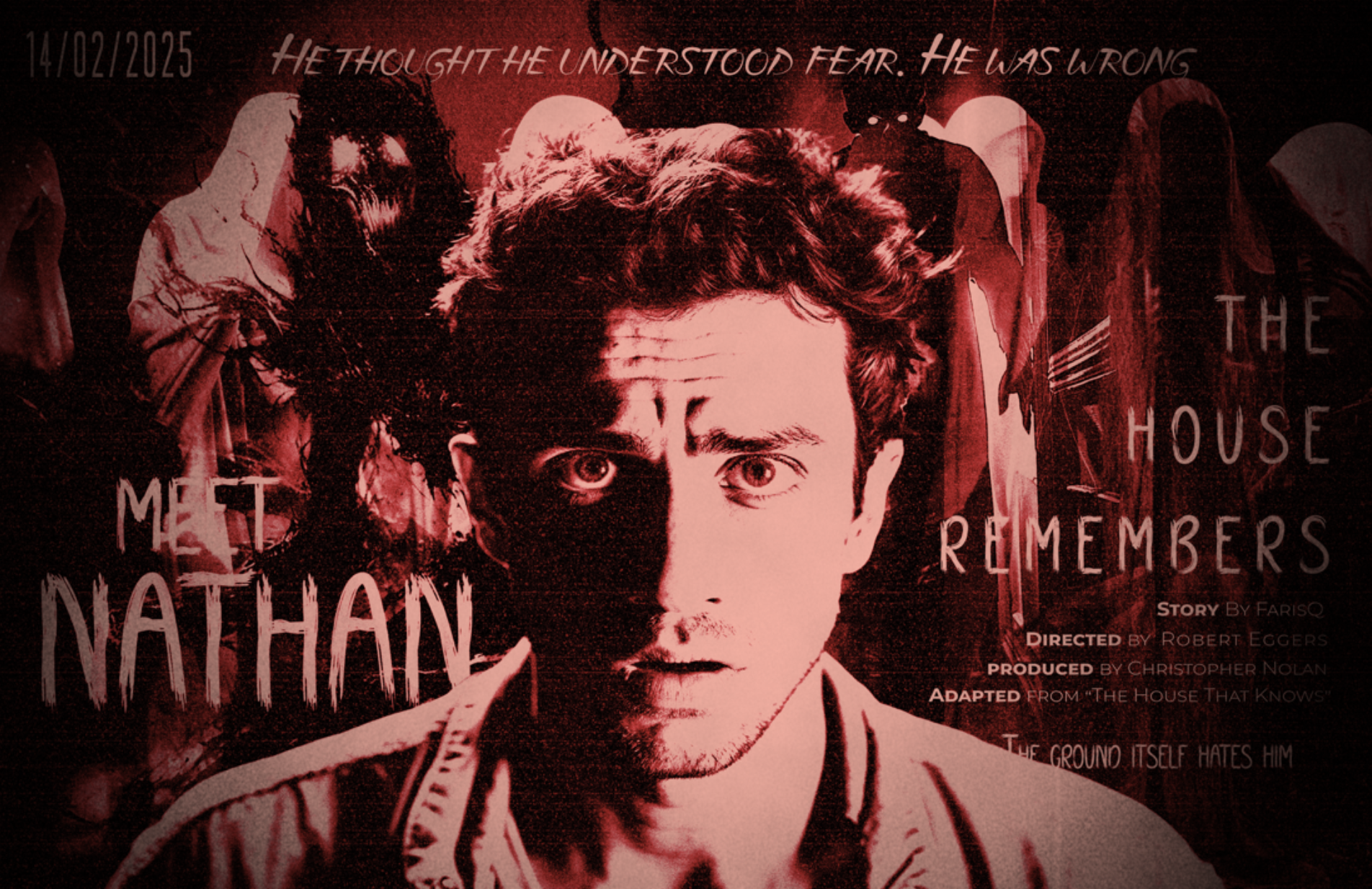
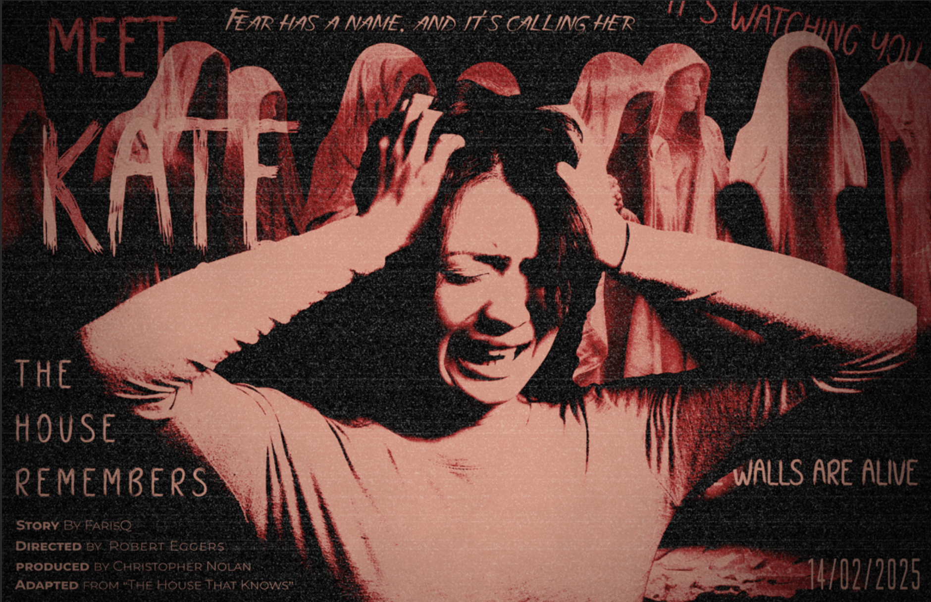
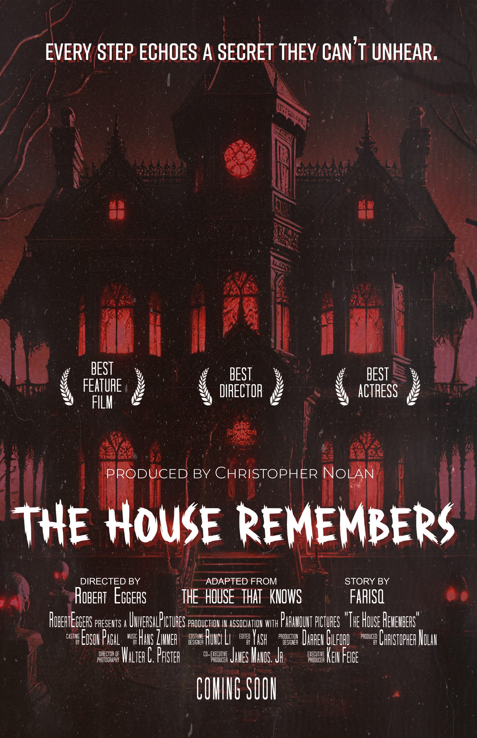
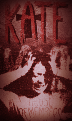
The House That Knows is a slow-burning psychological thriller about memory, trauma, and the spaces that never truly let us go. The story follows Nathan and Kate, siblings returning to their decaying childhood home to confront a past that’s been waiting.
This wasn’t just a novel—it was a full visual narrative system. Alongside writing the manuscript, I designed the book layout, created the cover, and developed an entire fictional film campaign to explore how the story might live on screen.
Story Summary
As Nathan and Kate begin peeling back the layers of their old home, memories resurface—some real, some imagined. The deeper they explore, the more the house begins to “remember” with them. Silence becomes a language. Shadows become familiar. And the truth? It’s far from comforting.
Some houses don’t forget.
Expanding the Narrative
While the book stood on its own as a complete narrative, I wanted to push its emotional reach further. That meant imagining how the story could live beyond the page—how its haunting tone, slow tension, and psychological themes could translate across mediums. This led to the idea of building a fictional film campaign, not just as an exercise in design, but as a deeper expansion of the story’s atmosphere and visual language.


Visual Direction
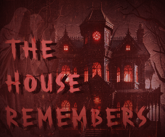
Book Cover Design:
-
Dark, gritty textures with subtle red lighting
-
A silhouetted house surrounded by negative space
-
Decay and memory represented through layered imagery
Typography & Layout:
-
Serif fonts for a literary tone
-
Dramatic chapter openings with symbolic illustrations
-
Careful spacing to emphasize suspense and narrative rhythm
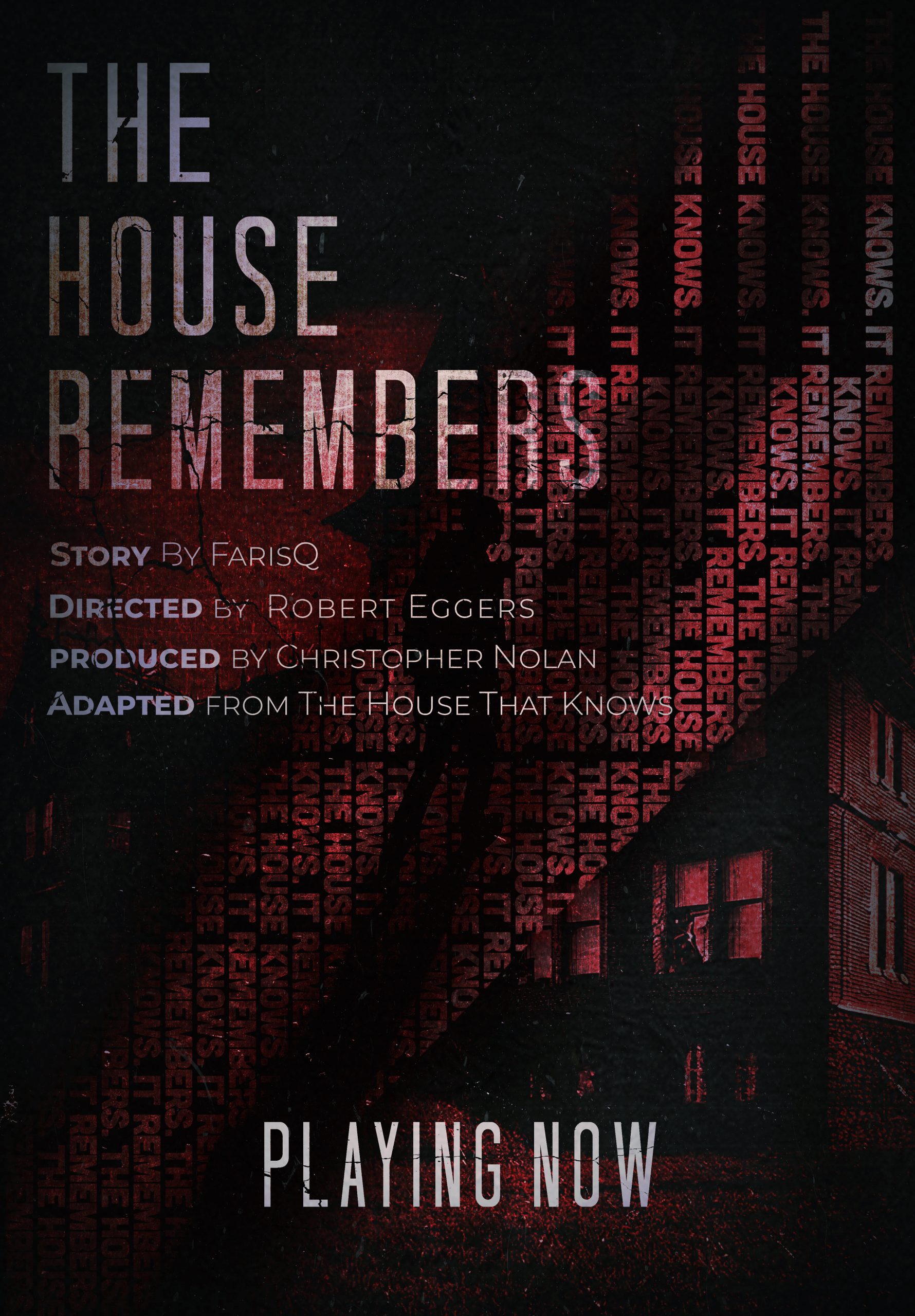
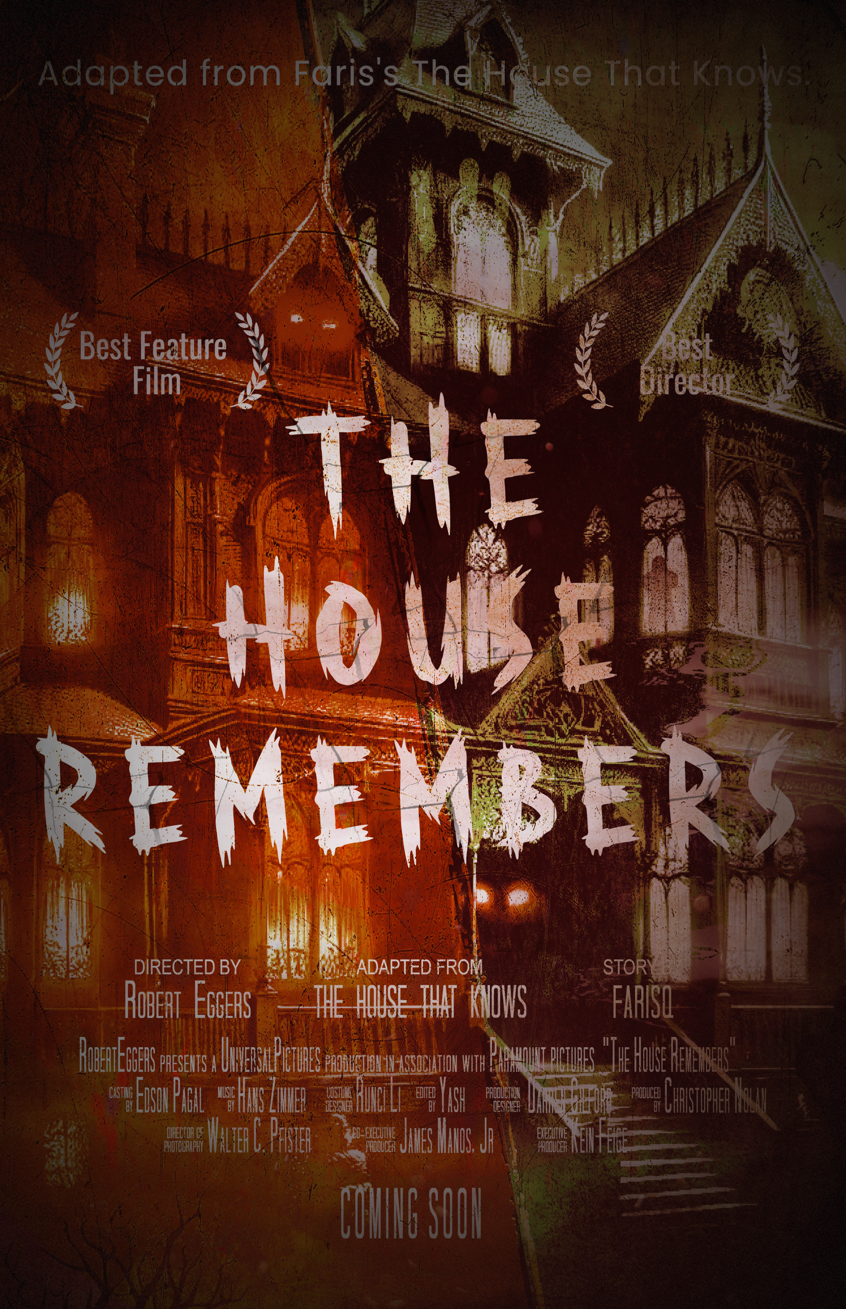
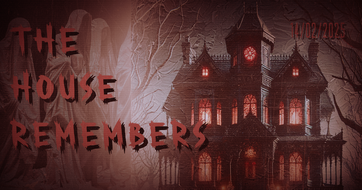
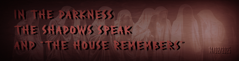
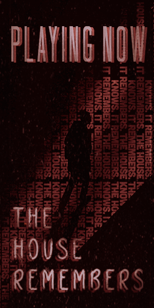
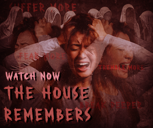
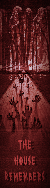
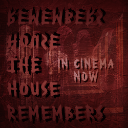
Fictional Movie Adaptation
To imagine the novel as a feature film, I created a full visual campaign:
-
5 Poster Designs: Symbolic, cinematic visuals aligned with horror themes
-
10 Ad Banners: Bold, short copy paired with haunting imagery
-
3 Instagram Carousels: Mini storytelling sequences teasing the plot
Each piece carried the story’s tone across platforms, building a consistent identity for a fictional adaptation.


Posters

My Contributions
-
Wrote and edited the full novel manuscript
-
Designed the cover and interior layout
-
Built the visual identity and branding for the story
-
Developed a full promotional campaign imagining the story as a film
Reflection
This was my first complete novel, and I approached it like a full creative production. Writing was just one part—design brought it to life. It taught me how tone guides everything, how story and style need to support each other, and how to manage long-term, multi-format projects from start to finish.
