
Concept Overview
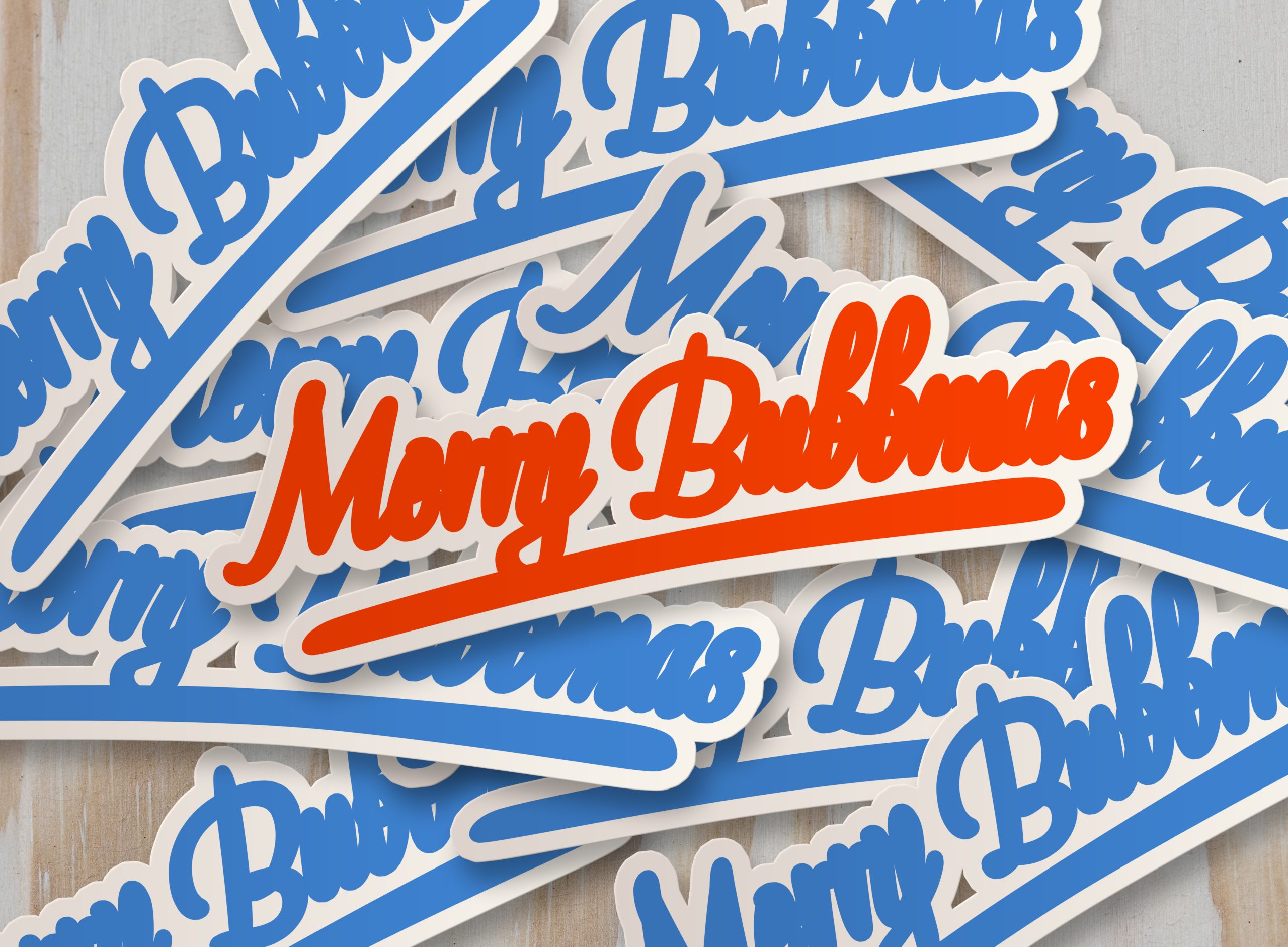
Bubblium is a fictional sparkling water brand created for Gen Z and Millennials—a product that feels more like a vibe than just a beverage. Instead of following the clean, minimal trend dominating the market, Bubblium leans into chaos, humor, and personality.
The goal was to build an expressive, multi-sensory brand world—loud, cheeky, and unforgettable. Each element, from flavor names to can designs, balances absurdity with visual clarity. It’s weird. It’s fizzy. And it works.
Brand Essence
Voice Traits:
-
Playful – Irreverent and unfiltered
-
Curious – Always trying something new
-
Adventurous – Each flavor is a risk worth sipping
-
Social – Made to be shared, posted, remembered
Sample Taglines:
-
“Sip the unexpected.”
-
“Refreshment with a twist.”

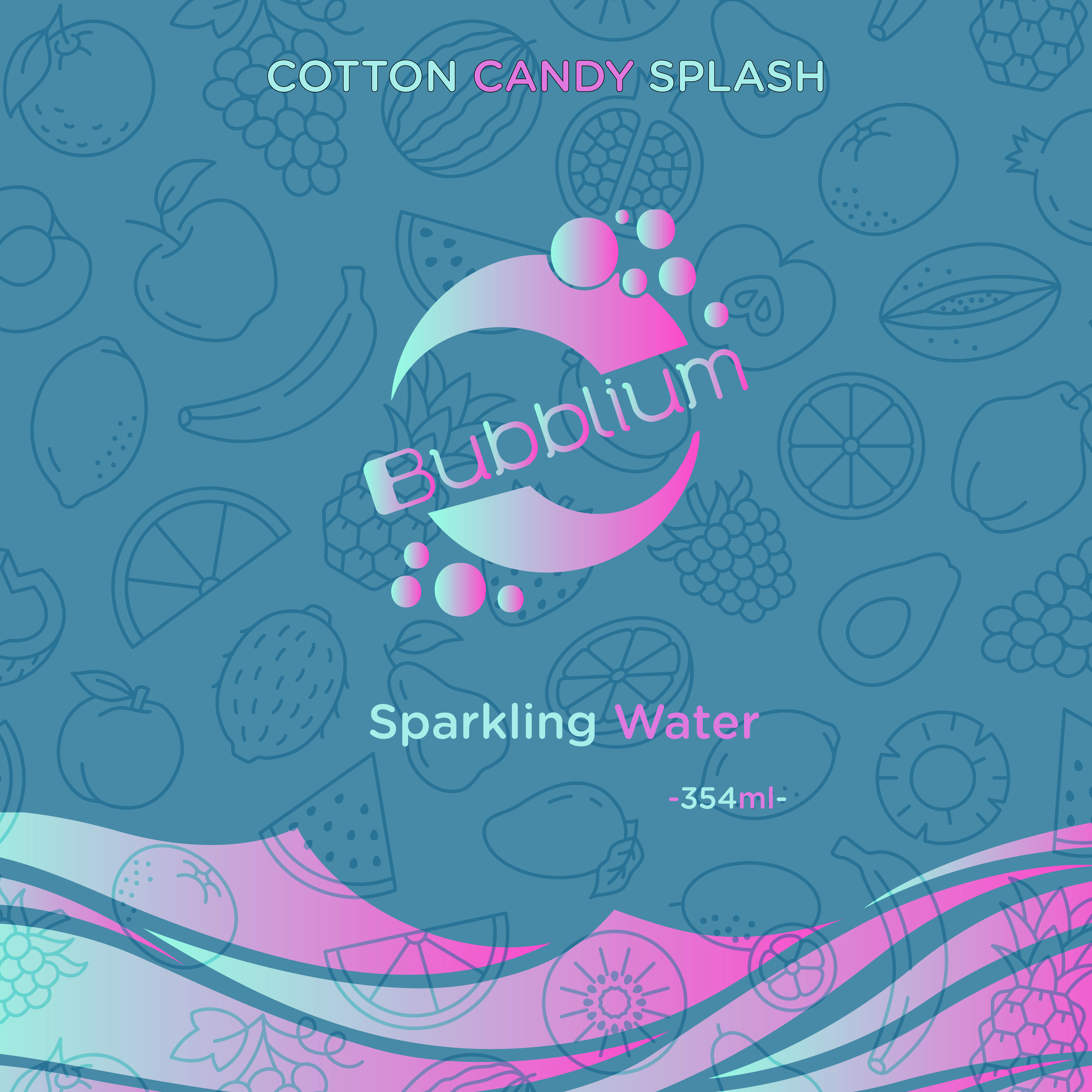
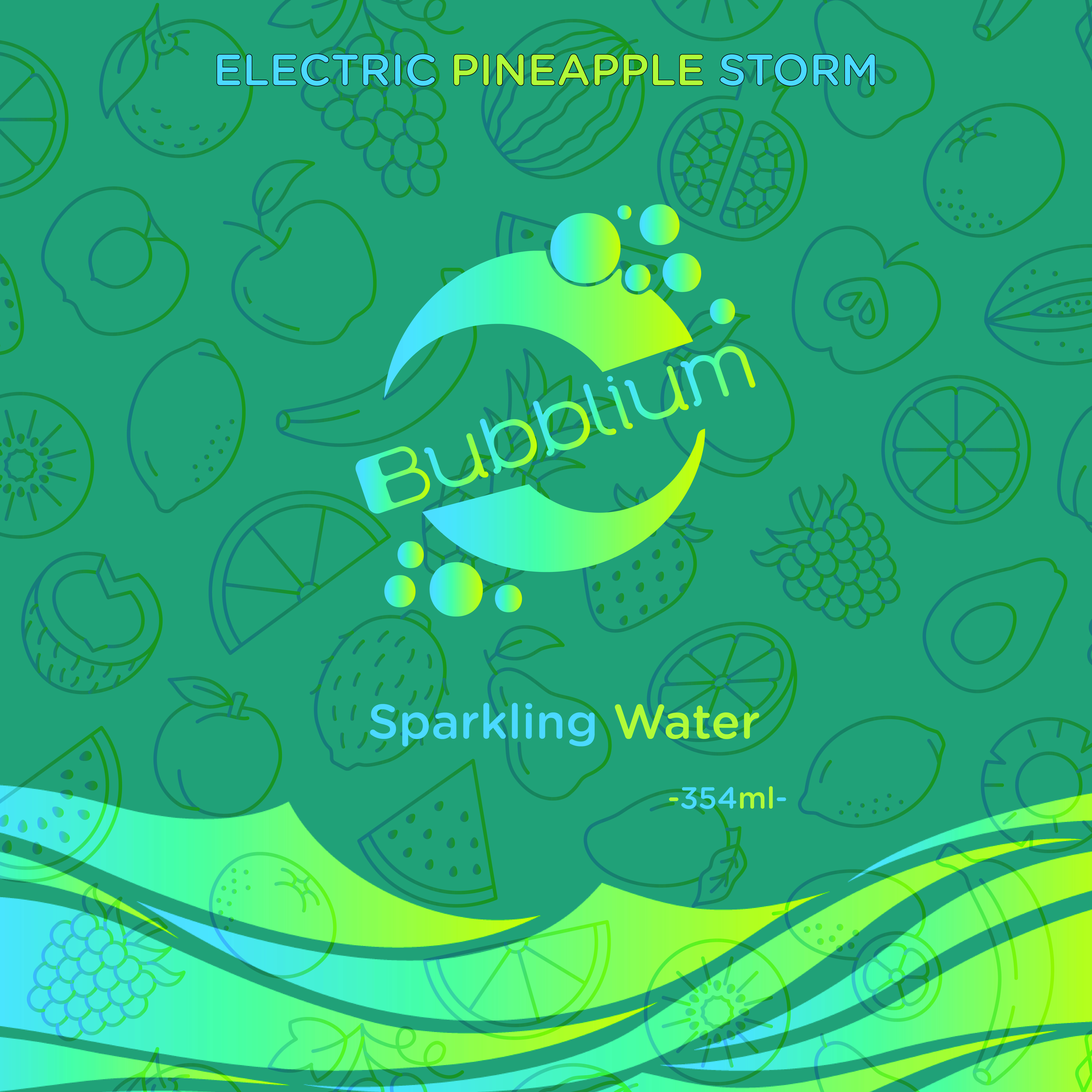
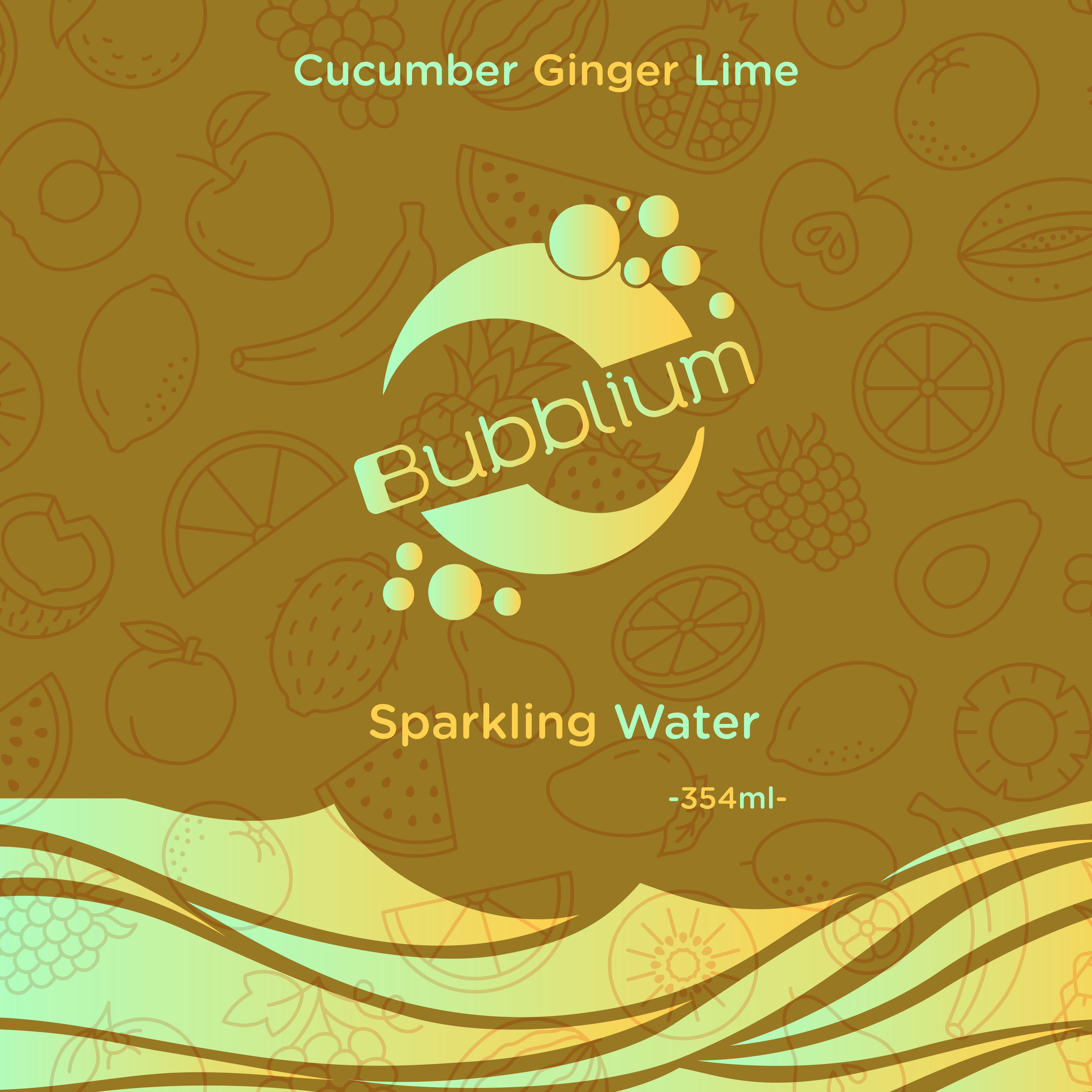
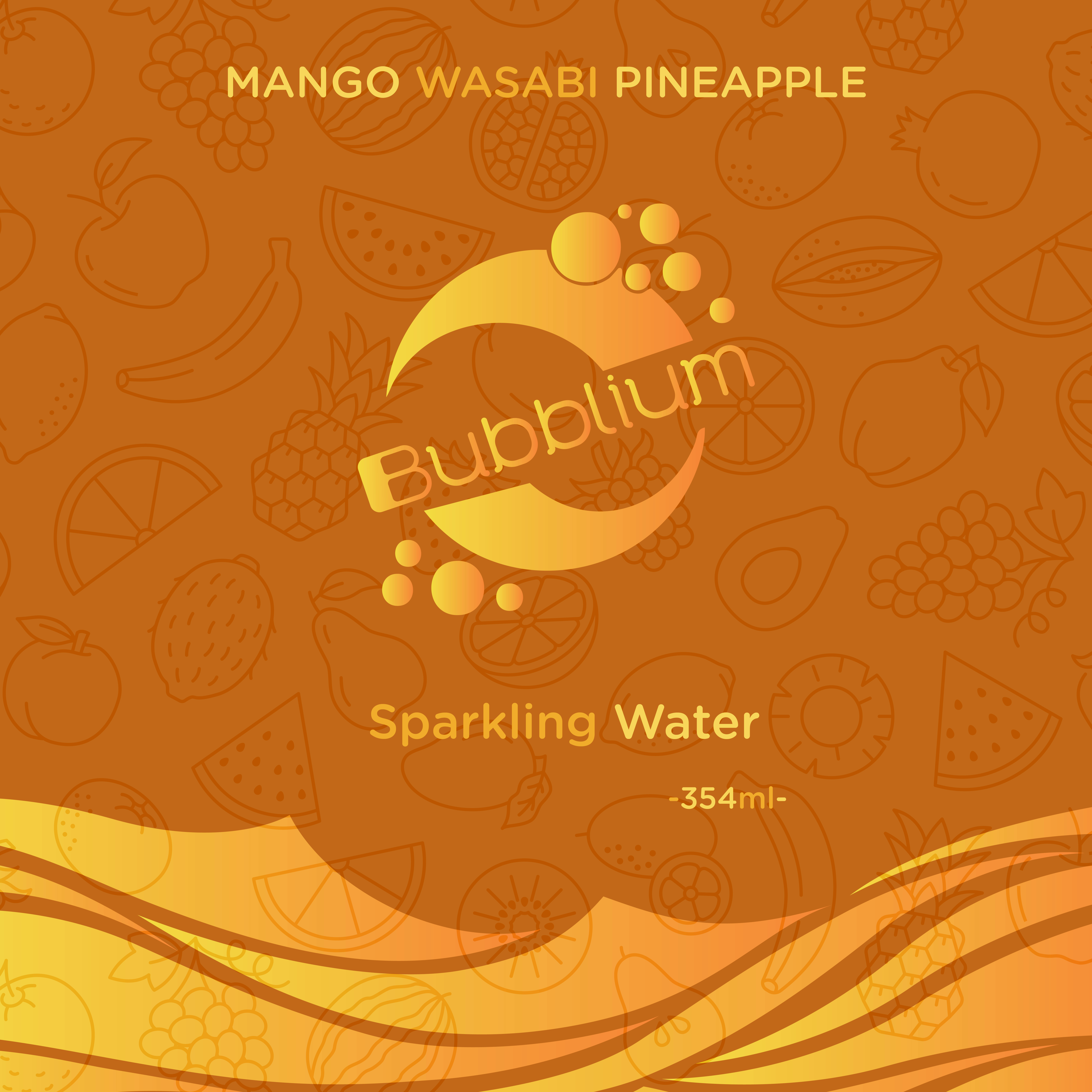
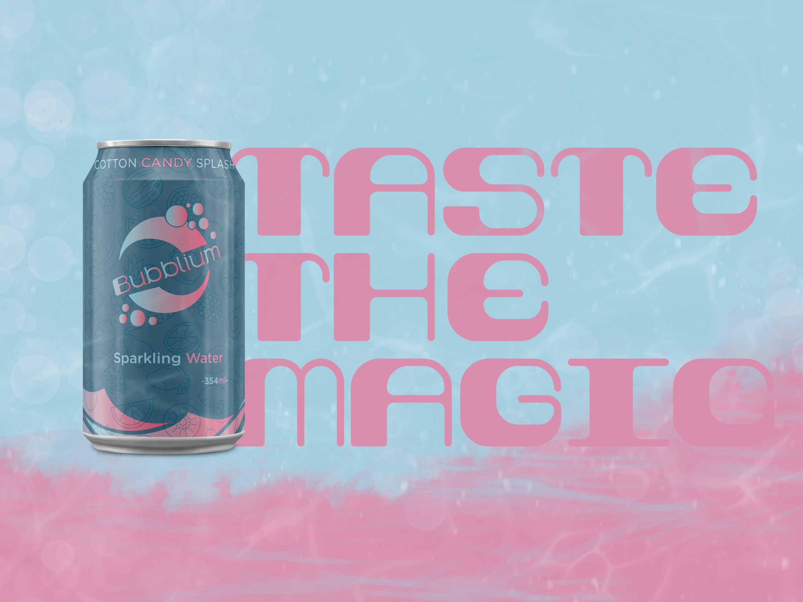
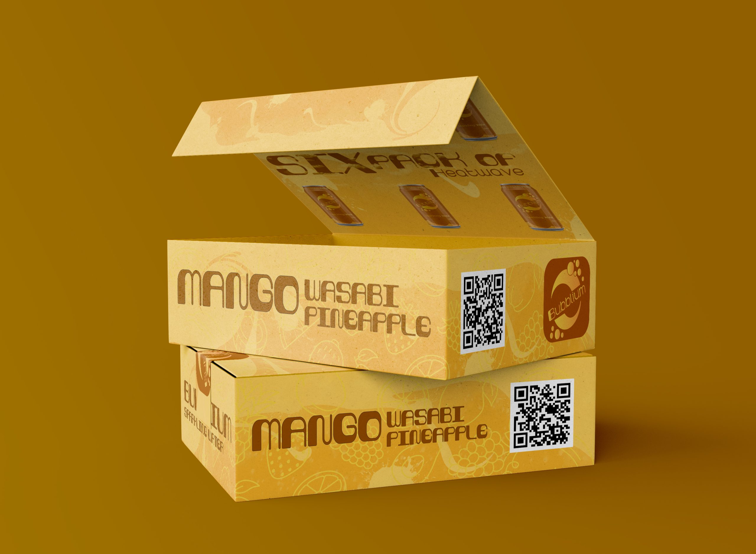
Label & Packaging System
A key part of this project was creating collectible can labels that extend the Bubblium brand into physical touchpoints.
Label Design Features:
-
Dual-gradient backdrops to represent flavor mood
-
Illustrated fruit patterns overlaid with tone-on-tone texture
-
Centered logo with responsive gradients
-
Bold, legible flavor names for shelf visibility
-
Wave textures at the base to mimic fluid movement
Flavor Examples:
-
Mango Wasabi Pineapple – Tropical gold with a citrus kick
-
Electric Pineapple Storm – Aqua to lime, buzzing with energy
-
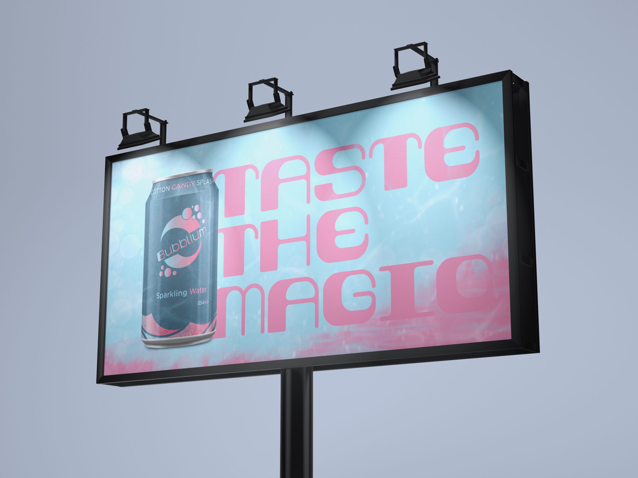
Cotton Candy Splash – Playful pastel tones, pure nostalgia
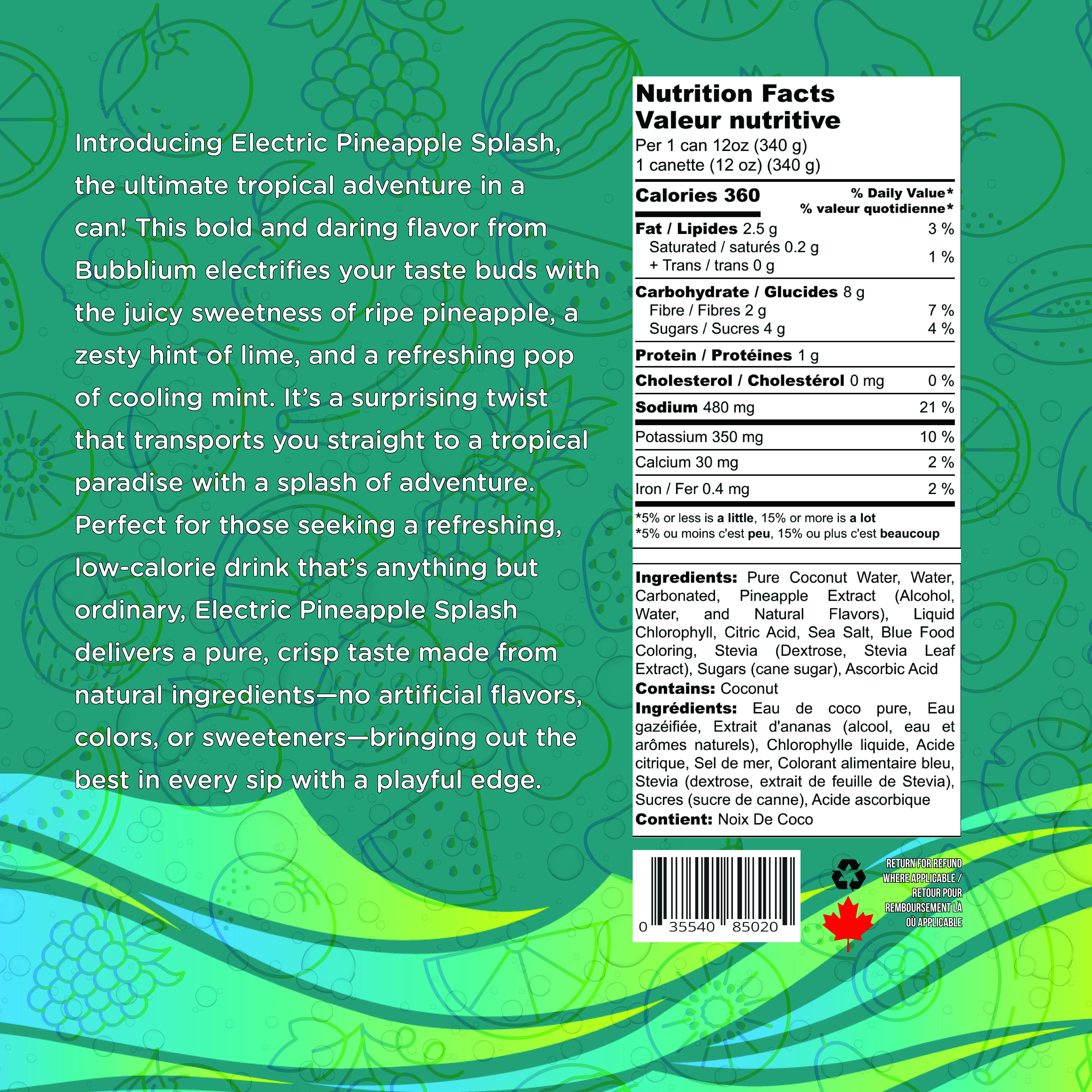
Each label includes real-world elements like bilingual nutrition panels and full ingredient lists—adding credibility to the fictional system.
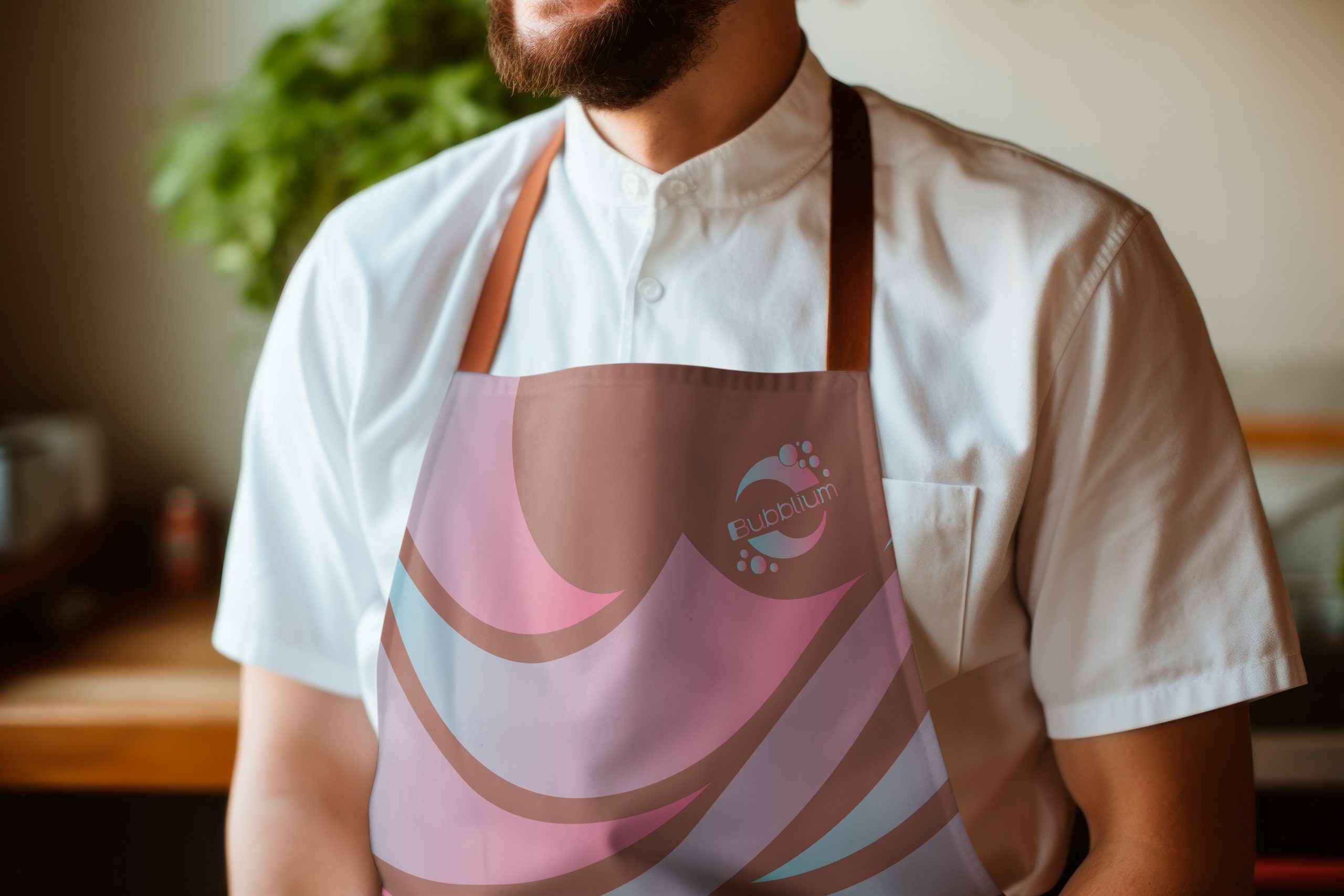
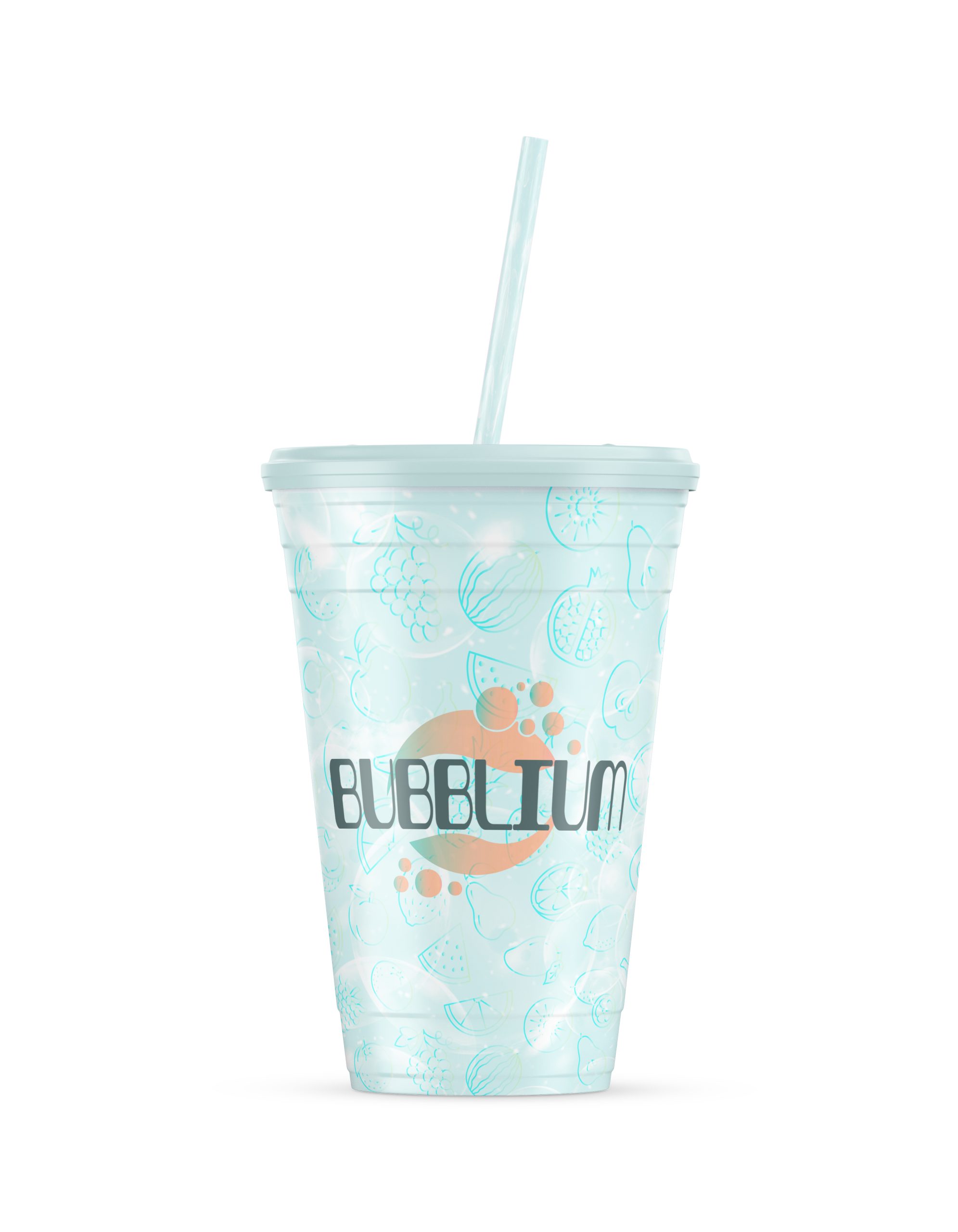
Digital & Print Applications
The visual system extended across multiple platforms to show Bubblium’s range:
-
Instagram & social campaign templates
-
Billboard mockups
-
Branded aprons, stickers, and merch
-
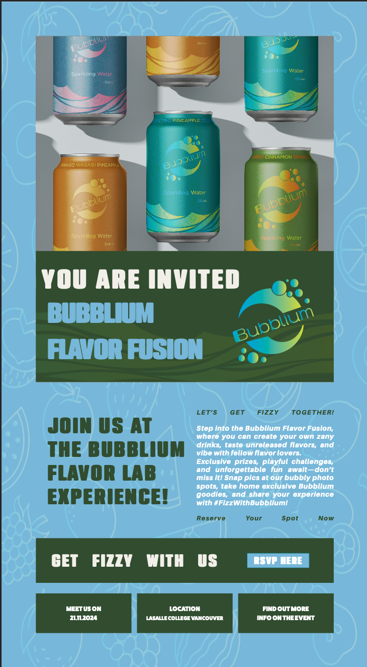
Custom email invites and digital ads
-
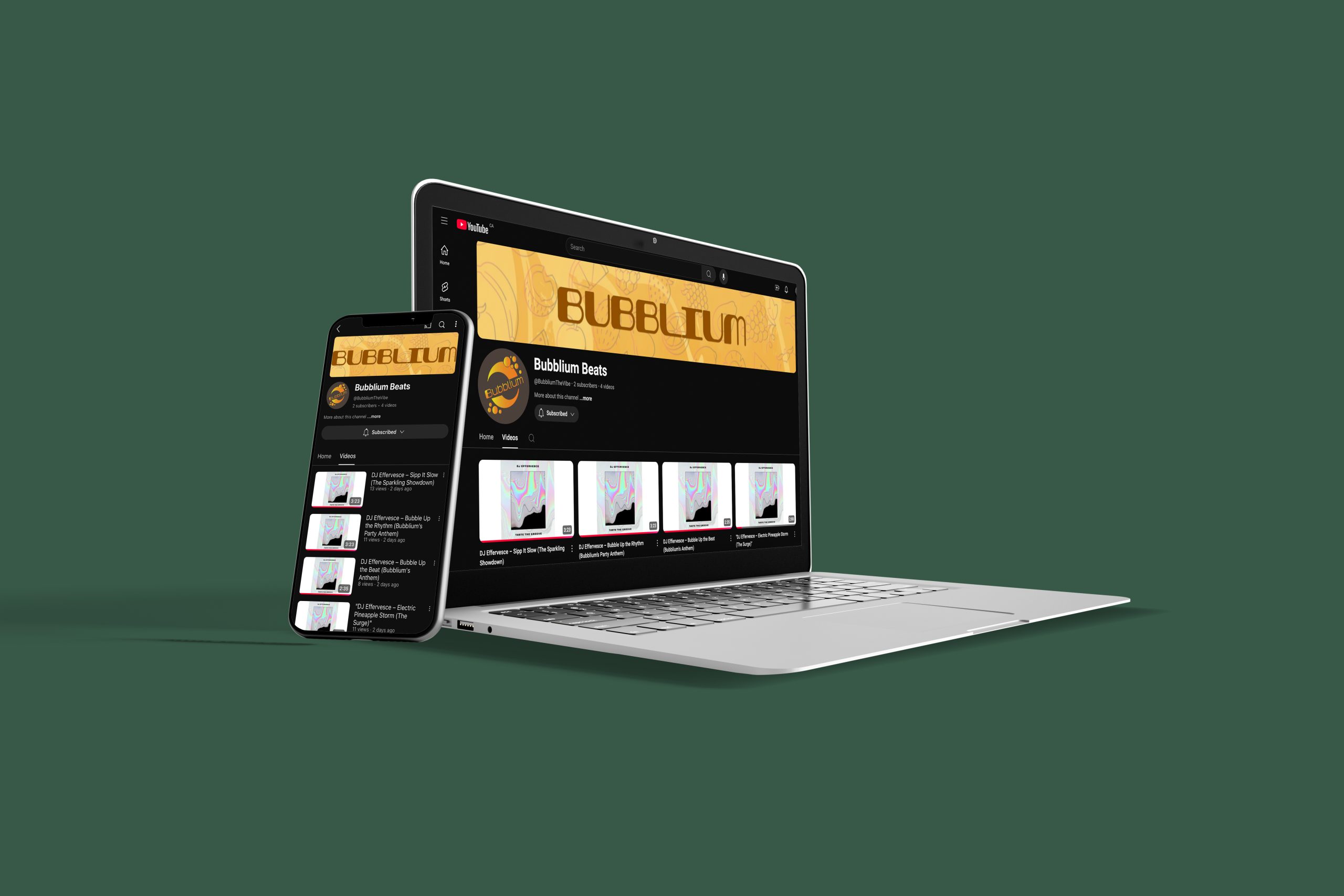
YouTube branding: Bubblium Beats
-
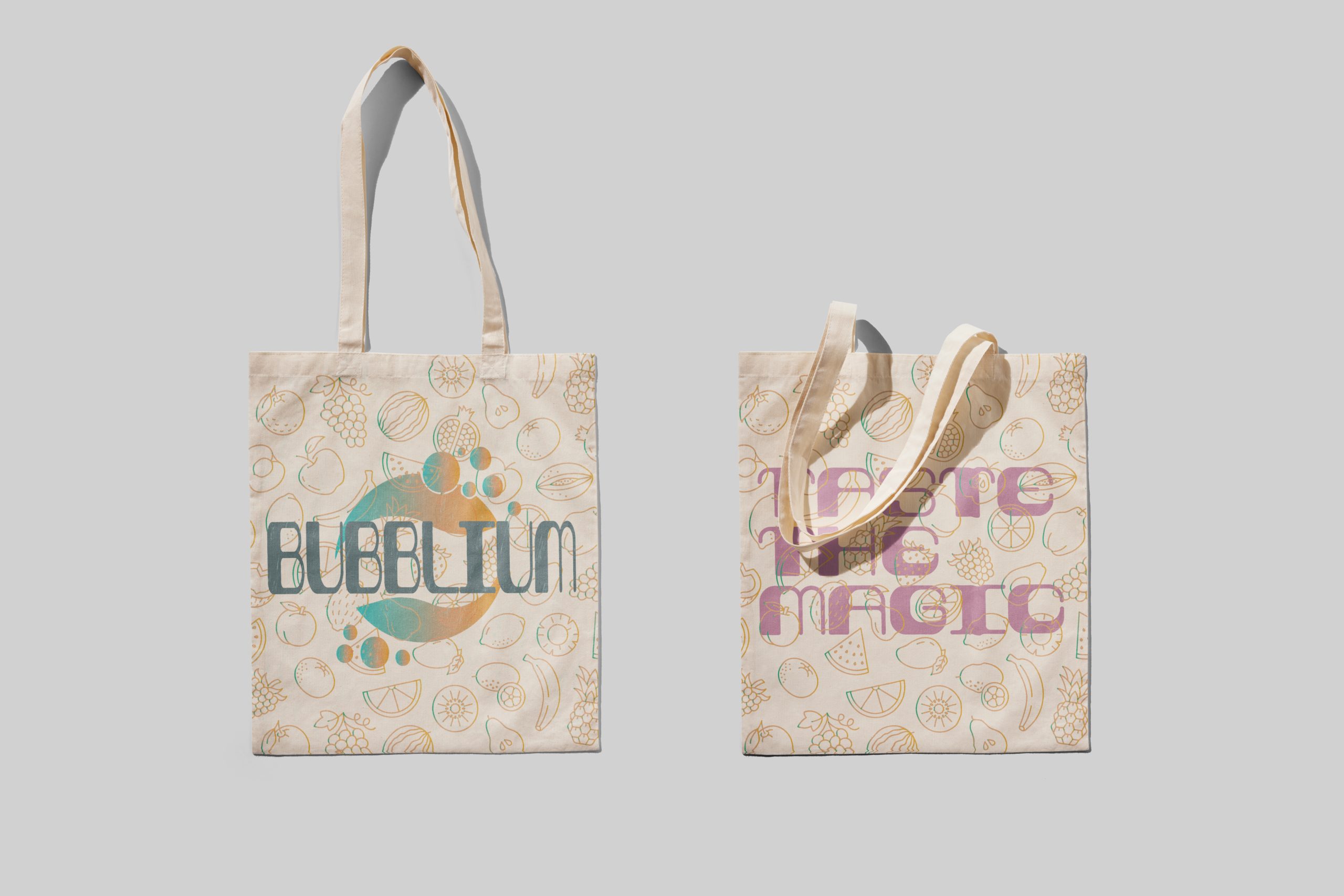
Employee badges and tote bags
The applications were designed to be unified yet never repetitive—expressive and chaotic, but never off-brand.
Motion & Campaign
I created a 15–30 second Dynamic Express Ad for digital platforms like TikTok and Instagram. It features:
-
Bold animated typography
-
Flavor splash transitions
-
Cans and merch in rapid flash cuts
-
Logo and tagline animated closeout
This helped give Bubblium movement and rhythm, capturing attention with speed and style.

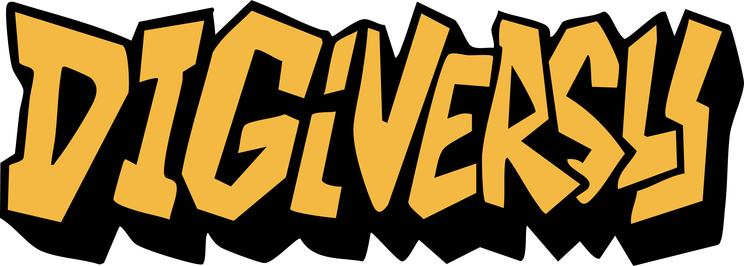
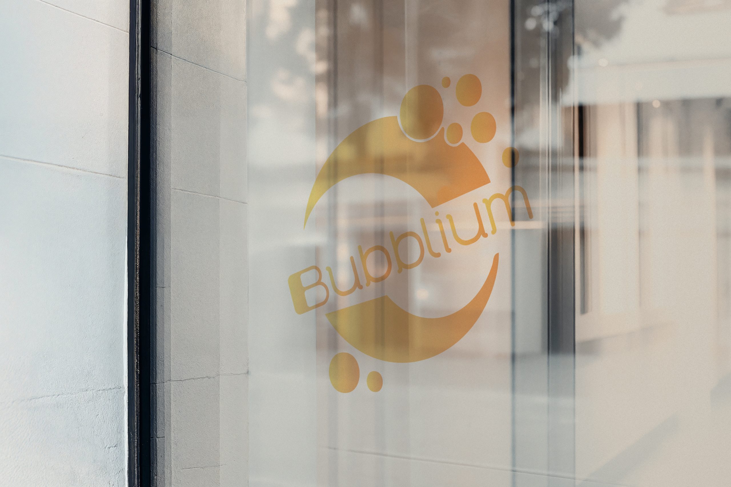
Visual Identity
Logo System:
-
Primary Logo – A bubbly, gradient-rich splash inspired by flavor explosions
-
Icon Mark – A quirky fish shape symbolizing movement and water
-
Text Logo – Soft, gradient wordmark ideal for both digital and print
Typography:
-
Retro60 – Used for headers and branding moments
-
Gotham Rounded – Used for flavor names and details
Colour Palette Concept:
Each flavor has its own dual-gradient colorway, reflecting the energy, personality, and vibe of the drink. The system was designed to stand out on crowded shelves while maintaining color harmony across the brand.

Final Thoughts
Bubblium challenged me to push branding beyond the visual—into texture, behavior, and even sound. It taught me how to build consistency without losing playfulness, and how to communicate personality through chaos. From wild flavor concepts to immersive campaigns, this project became a celebration of design that refuses to be quiet.
