
Project Overview
Haruki Threads is a conceptual slow fashion brand inspired by Japanese culture, minimalism, and the quiet strength of nature. This project involved creating a full brand identity system from the ground up—starting with name development and ending with logo design, typography, color palette, and real-world mockups.
The goal: to design a fashion label that communicates calm sophistication, cultural authenticity, and timeless beauty—without relying on clichés or trends.
Visual Identity
The visual identity of Haruki Threads is built around the ideas of balance, grace, and natural rhythm. Every element is designed to feel intentional and poetic, echoing the brand’s foundation in Japanese cultural harmony and timeless fashion.
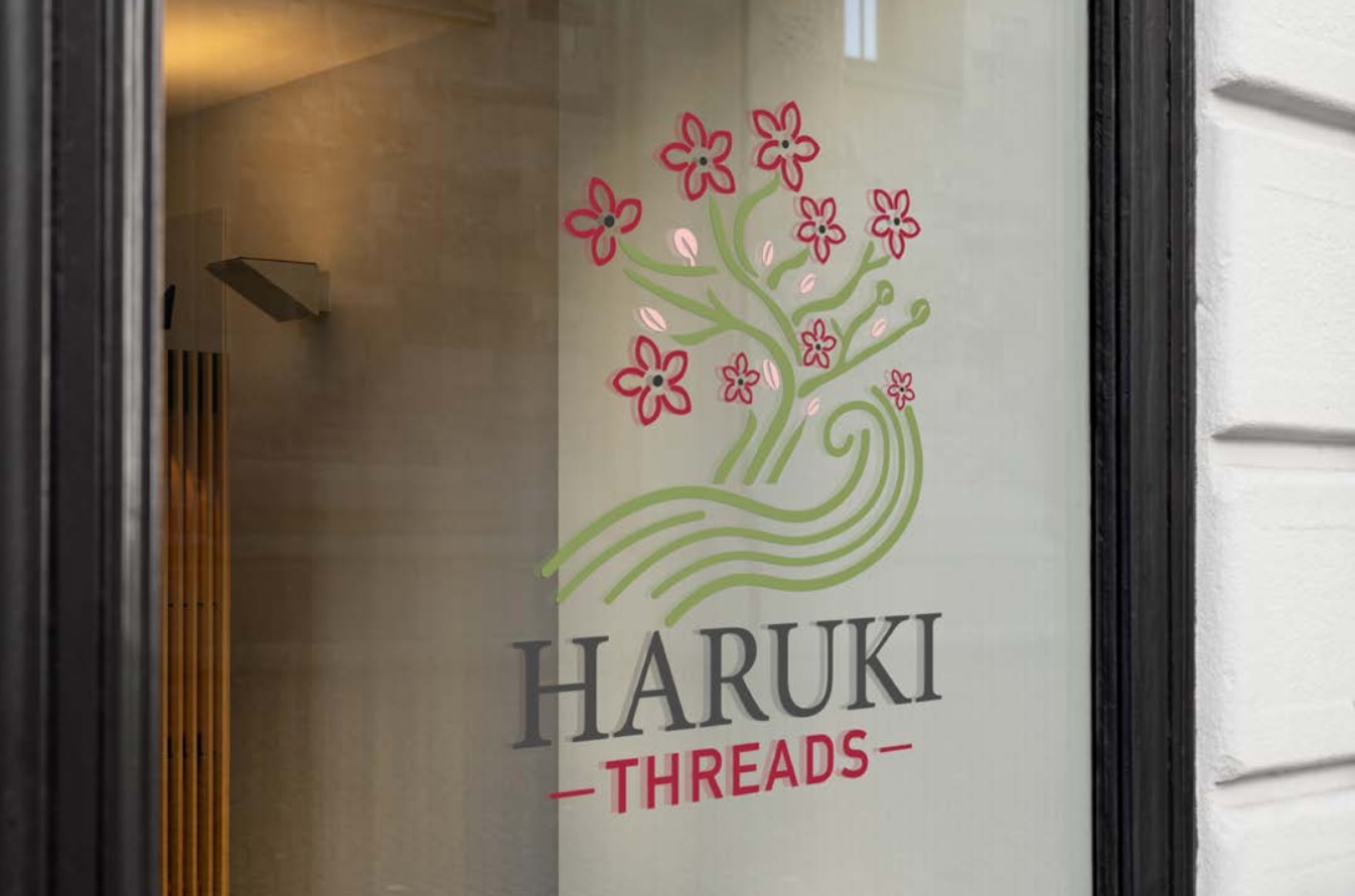
Logo Design
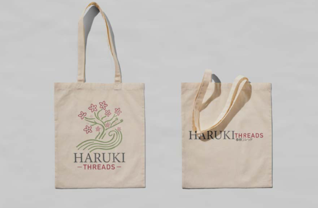
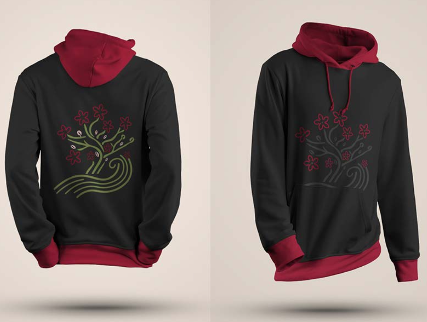
The Haruki Threads logo merges the organic flow of tree branches with the structured lines of woven fabric. It reflects nature, growth, and elegance in a clean, modern silhouette. Designed for flexibility, the logo adapts well across tags, packaging, and digital spaces without losing impact.
Colour Direction
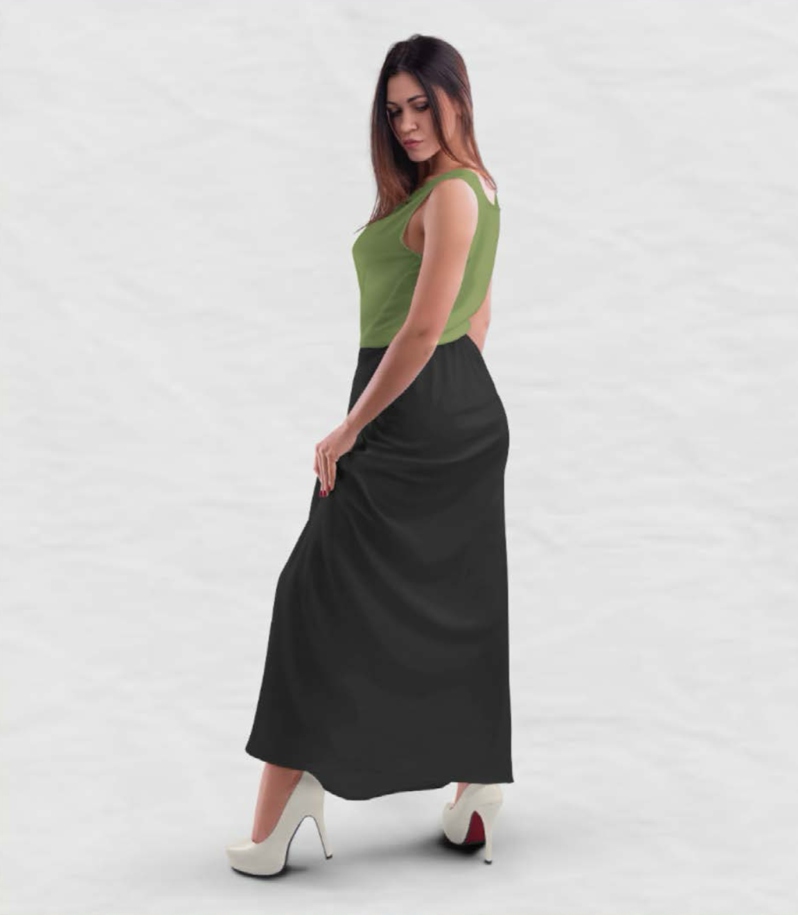
The palette features warm neutrals and nature-inspired tones—soft sage green, cherry blossom red, and grounding charcoal. These hues convey a sense of peace, seasonal beauty, and quiet confidence.
Typography
The brand pairs a refined serif typeface for its logo and headers with a minimalist sans-serif for supporting text. This balance of tradition and modernity reinforces Haruki’s identity as both timeless and contemporary.

Naming the Brand
The name “Haruki” (春樹) translates to spring tree, symbolizing renewal, balance, and deep roots. Paired with the word “Threads,” it becomes a fashion label that feels intentional and poetic.
I explored over 25 Japanese-inspired name options—tested for language accuracy, symbolism, and emotional tone. Other candidates included:
-
Satoru Wear – wisdom and clarity
-
Kazuhiko Styles – classic elegance
-
Michiko Collective – community and softness
-
Takara Essentials – value and tradition

Brand in Action
The elegance of Haruki Threads extends beyond the logo—it lives through every stitch, every surface, and every interaction.
From embroidered hoodies and minimalist tote bags to high-end embossed stationery, each application reflects the brand’s core: quiet power, nature-inspired balance, and lasting quality.
The logo’s adaptable structure allows it to shine across fashion, packaging, and storefront signage, always maintaining clarity and grace.
Whether printed on fabric, glass, or textured paper, the brand delivers a visual calm that feels both modern and rooted.
Reflection
This was my first full branding project, and it pushed me to learn everything from the ground up—naming, visual identity, tone, and presentation. It taught me how to design with intention, finding impact not through trends, but through clarity, restraint, and cultural respect. I gained a deeper understanding of how type, layout, and symbolism work together to tell a cohesive brand story—and it set the foundation for how I approach branding today.
